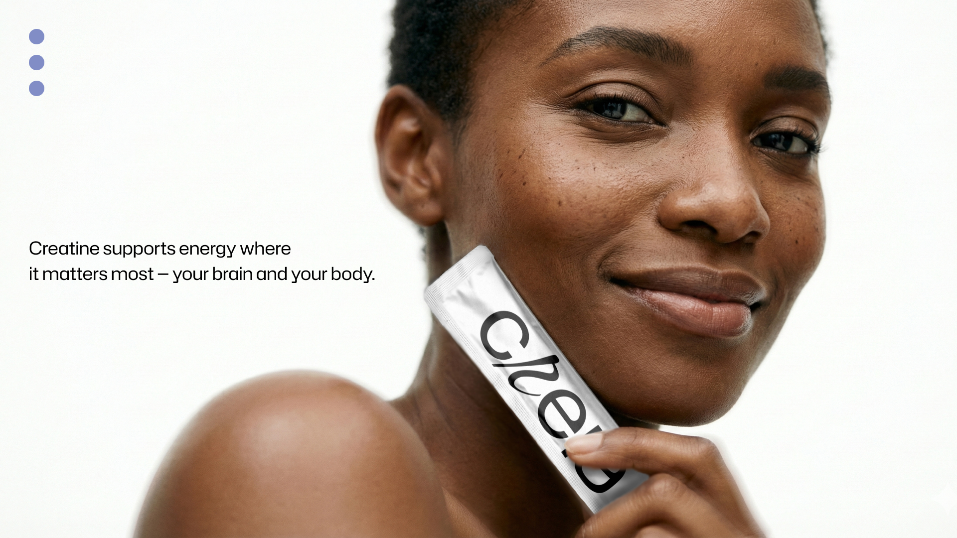
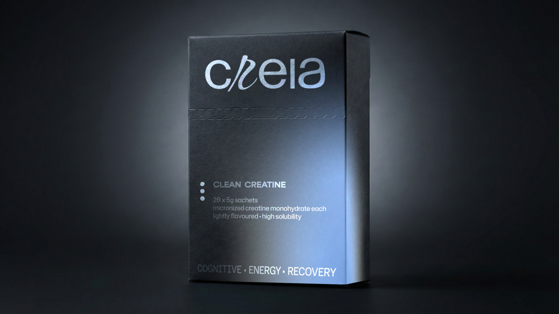
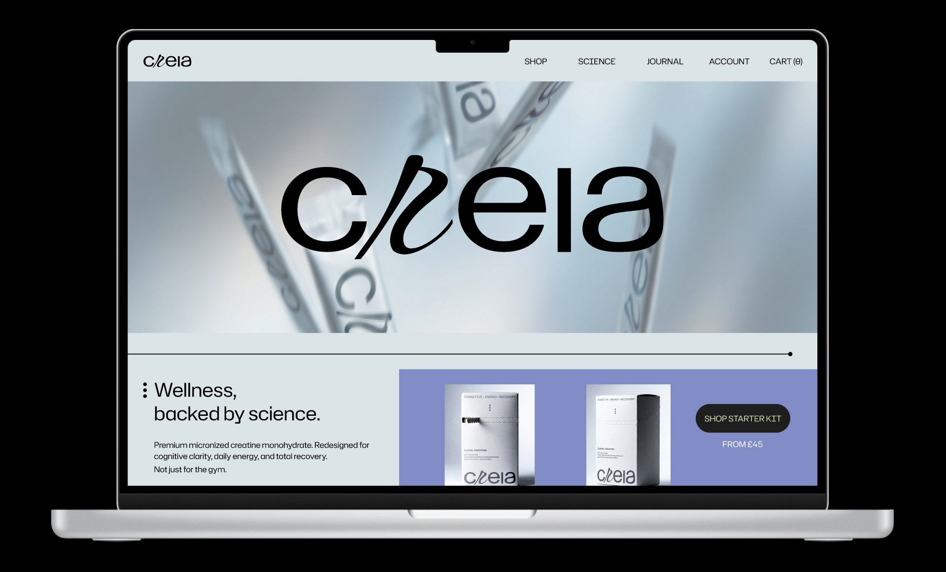
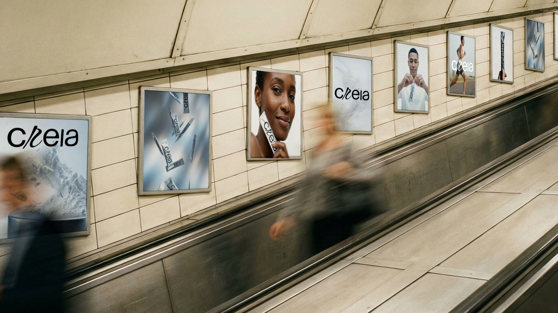
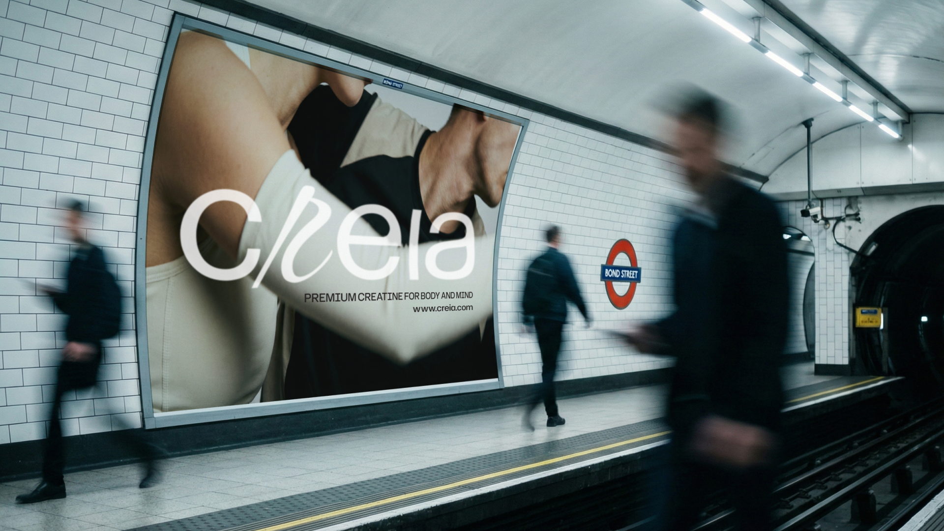
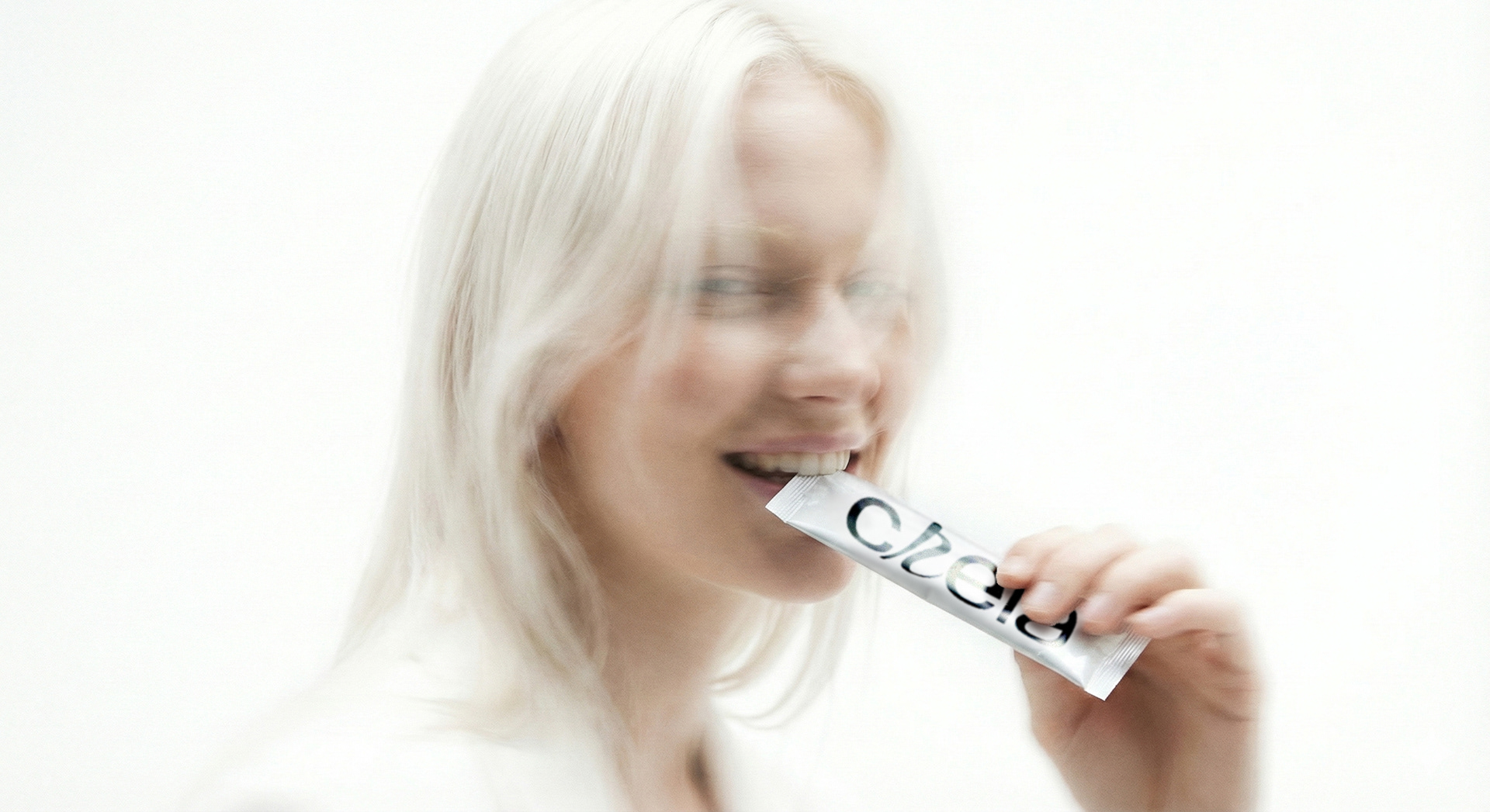
CREIA is a UK founded supplement and wellness brand that challenges the hyper-masculine conventions of the supplement industry, redefining creatine as a cognitive essential for the modern wellness consumer. The objective was to strip away the aggressive 'gym-bro' aesthetic to create a brand that feels gender-neutral, scientifically credible, and undeniably premium.
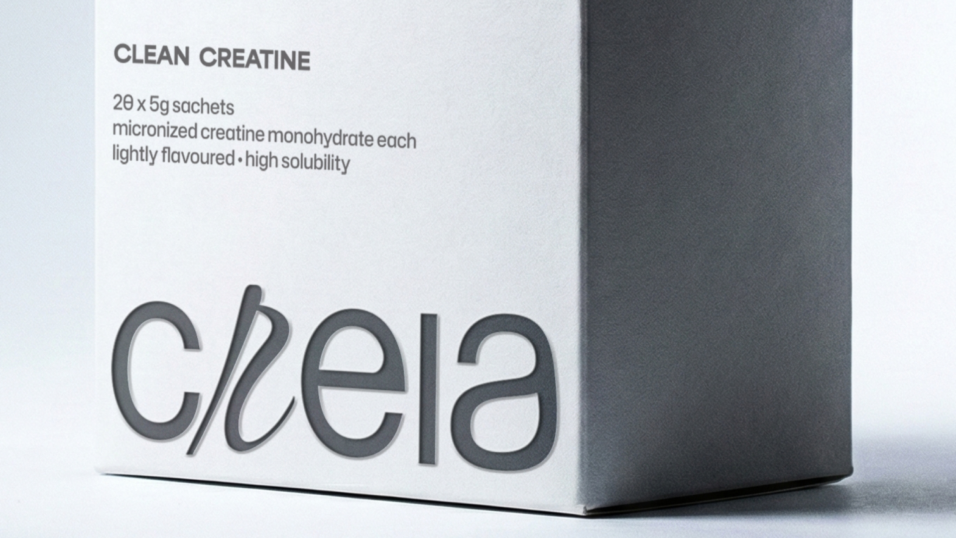
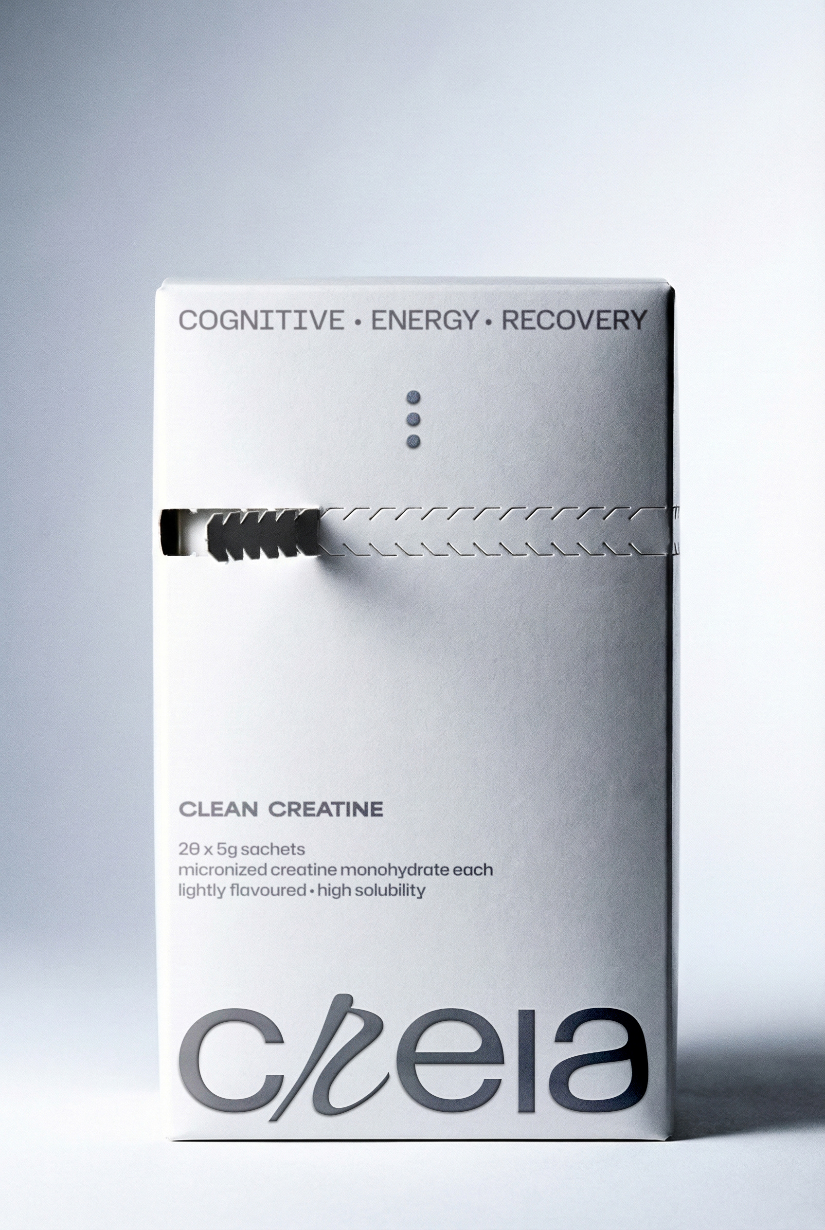
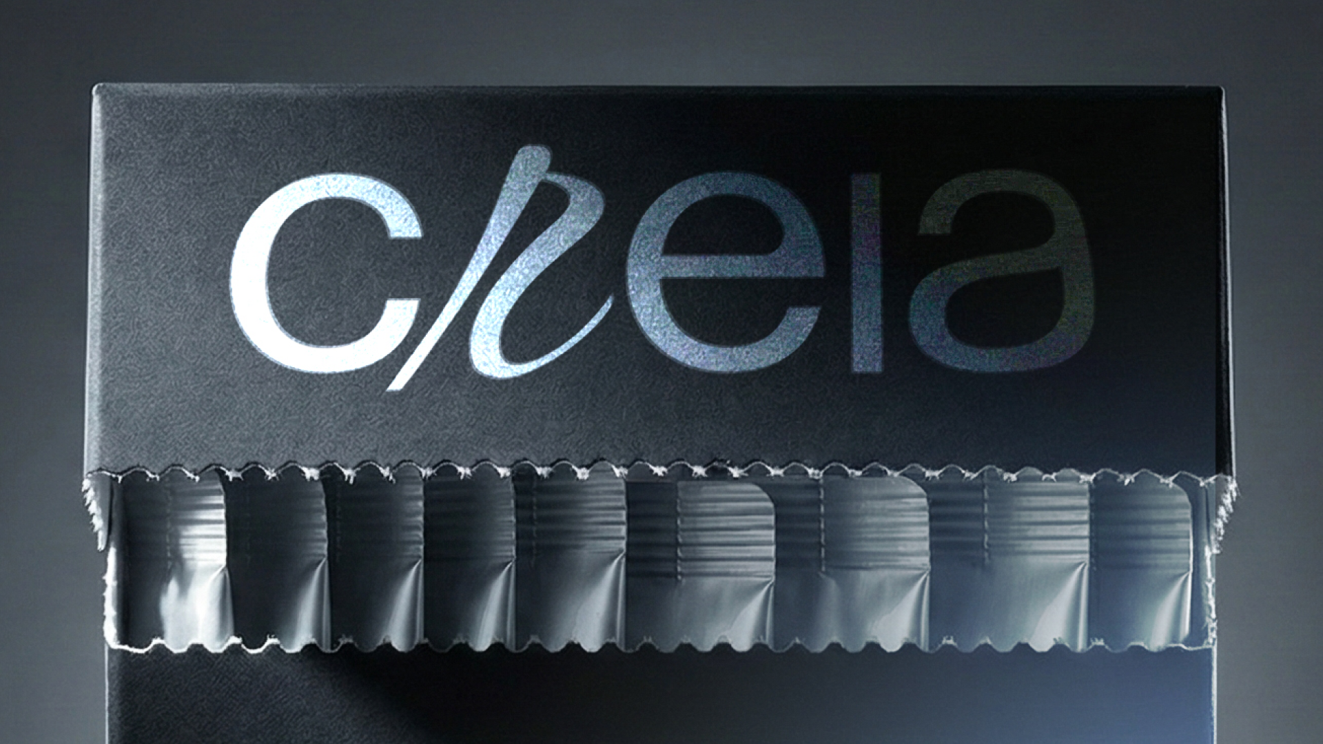
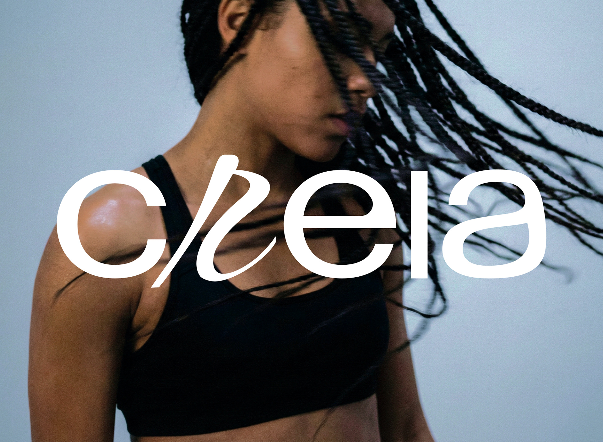
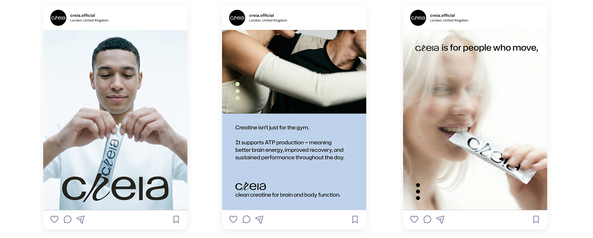
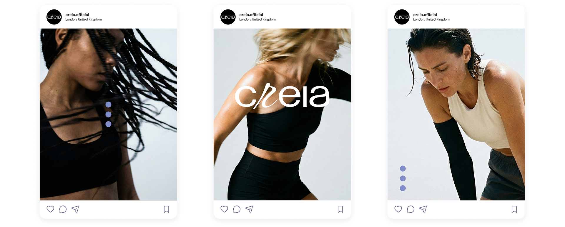
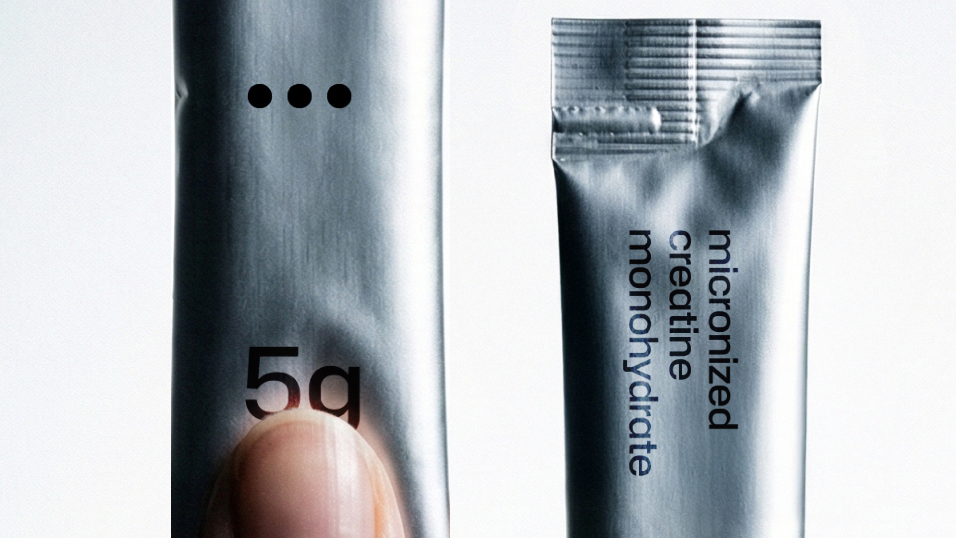
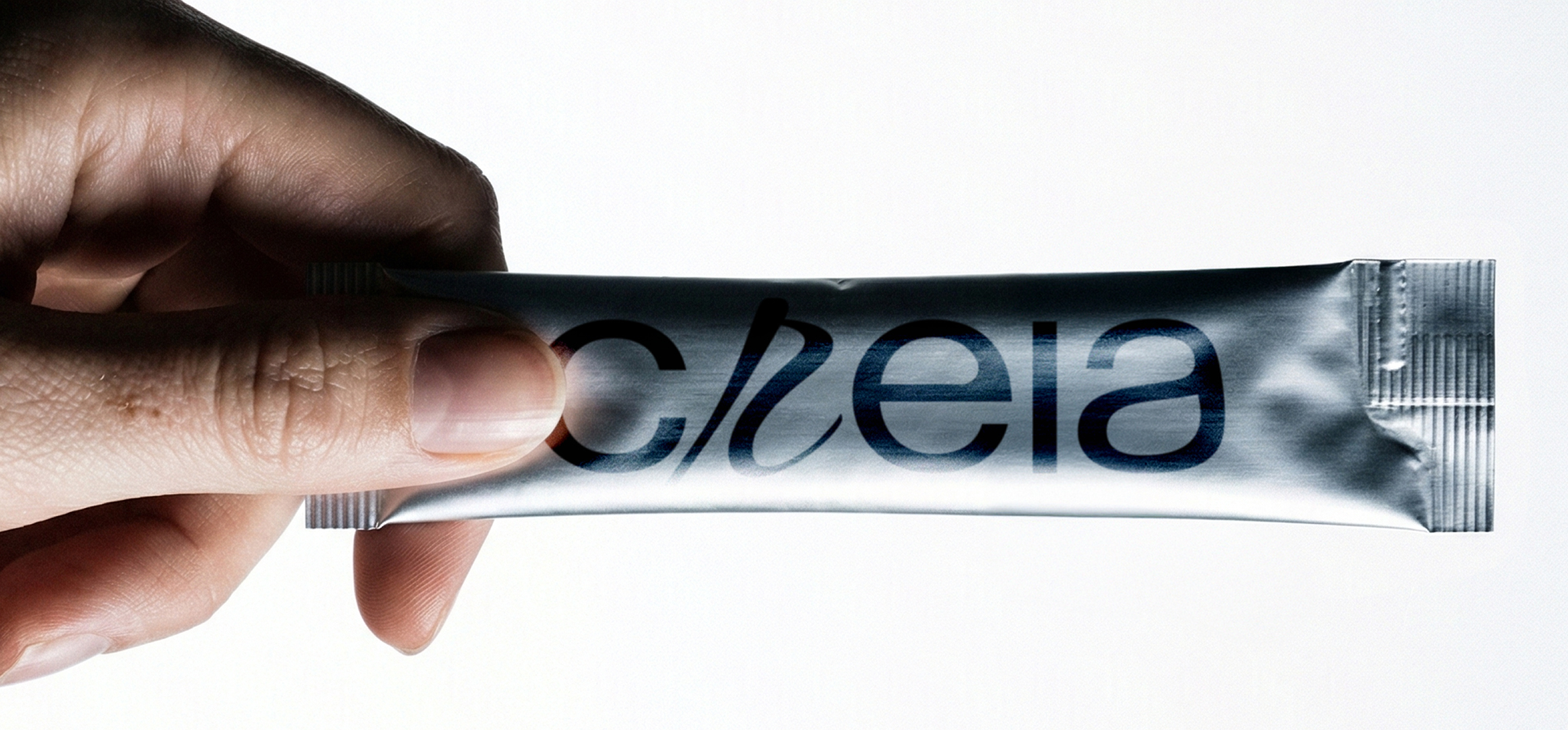
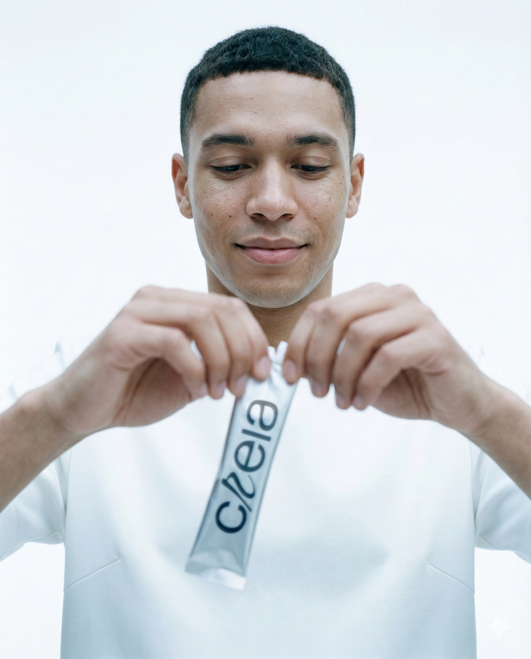
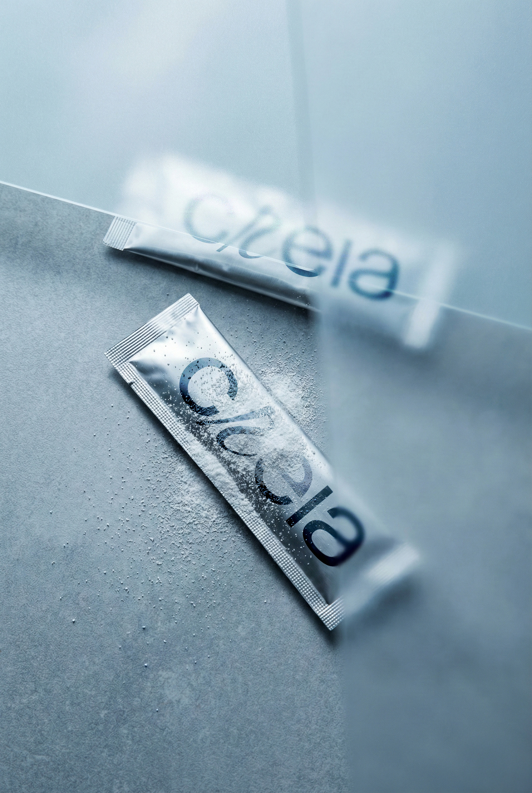
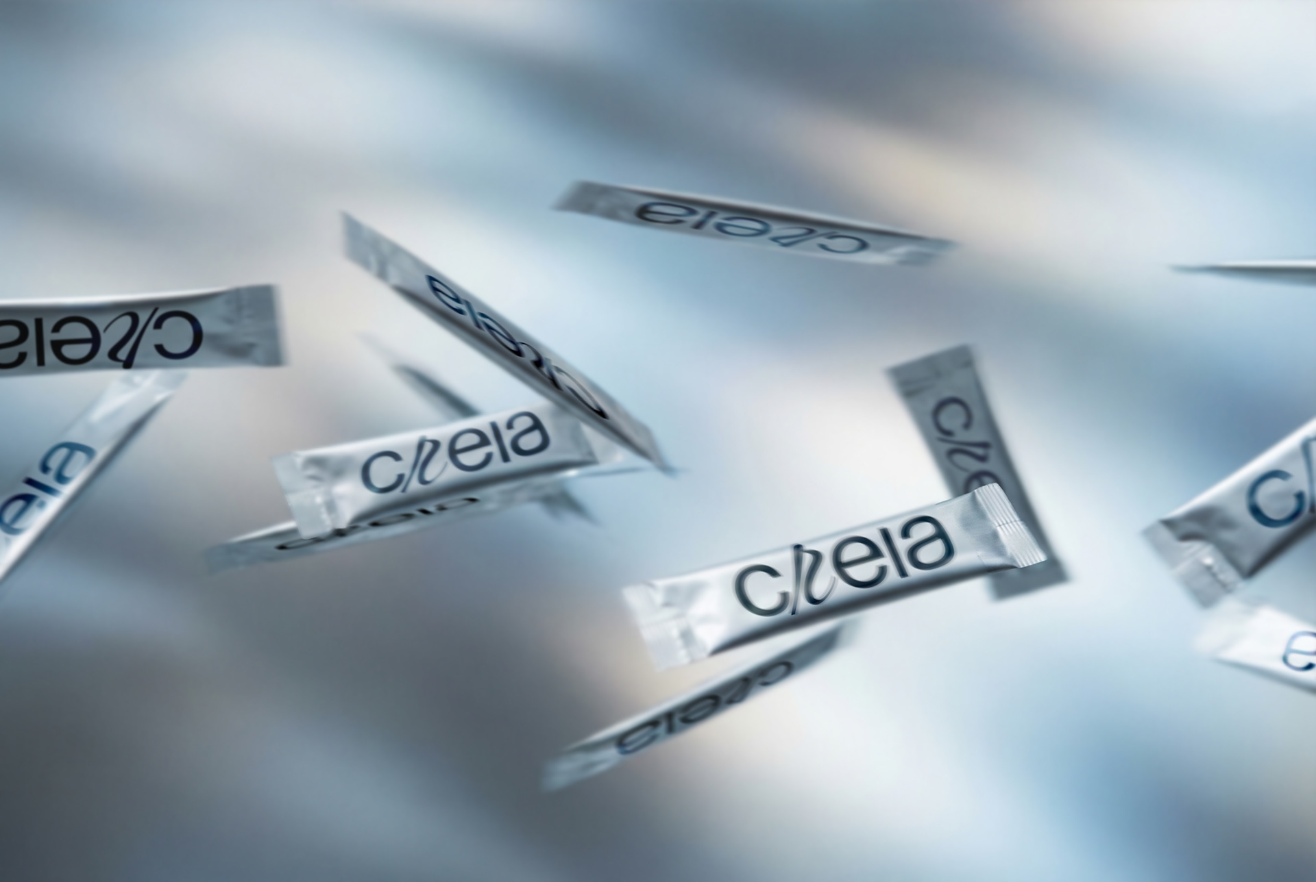
The comprehensive identity system bridges the gap between clinical trust and fashion-forward lifestyle. Deliverables included a custom logo system symbolizing absorption and flow , a dual-direction packaging strategy featuring silver foil and matte finishes , and a robust art direction guideline that champions authentic, high-energy human movement.

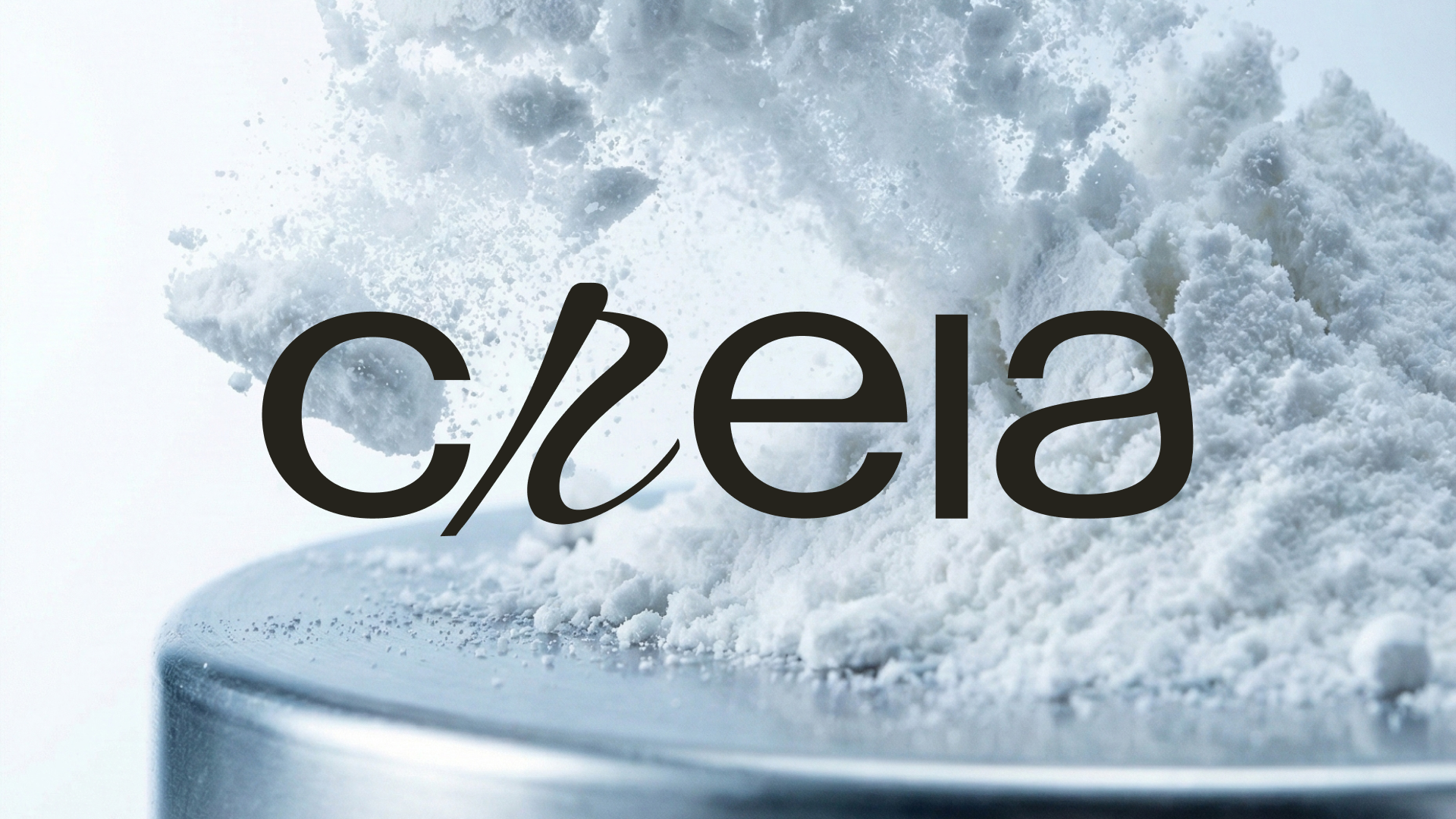
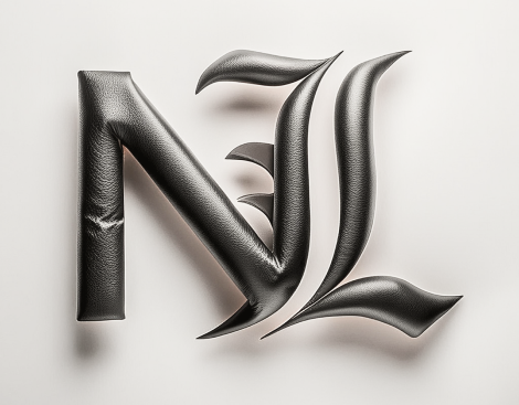
Main Logo
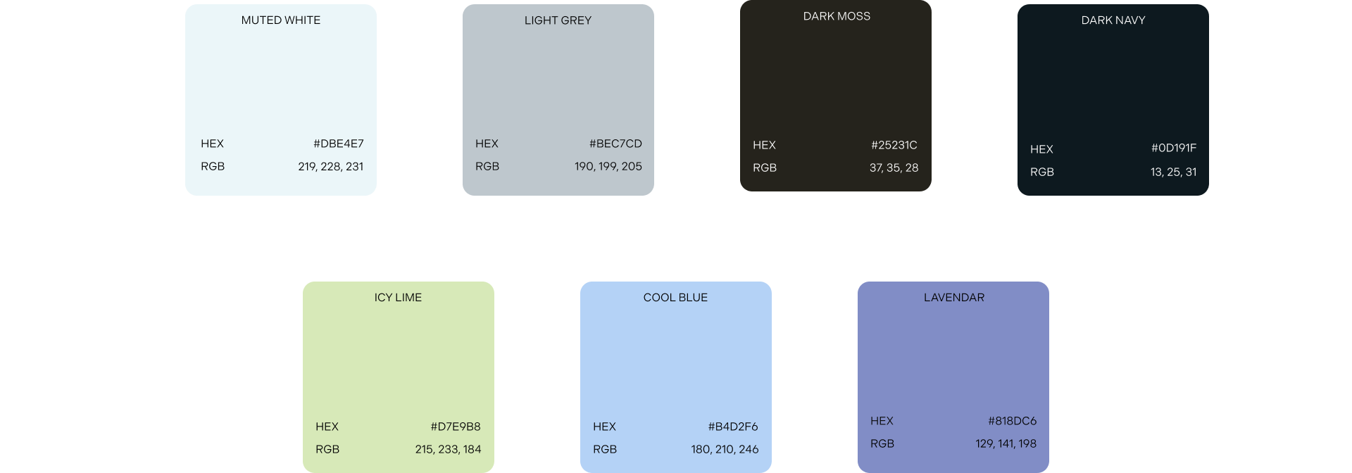
Colour Palette
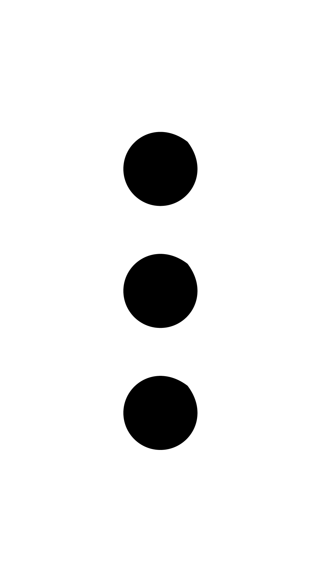
The Triad
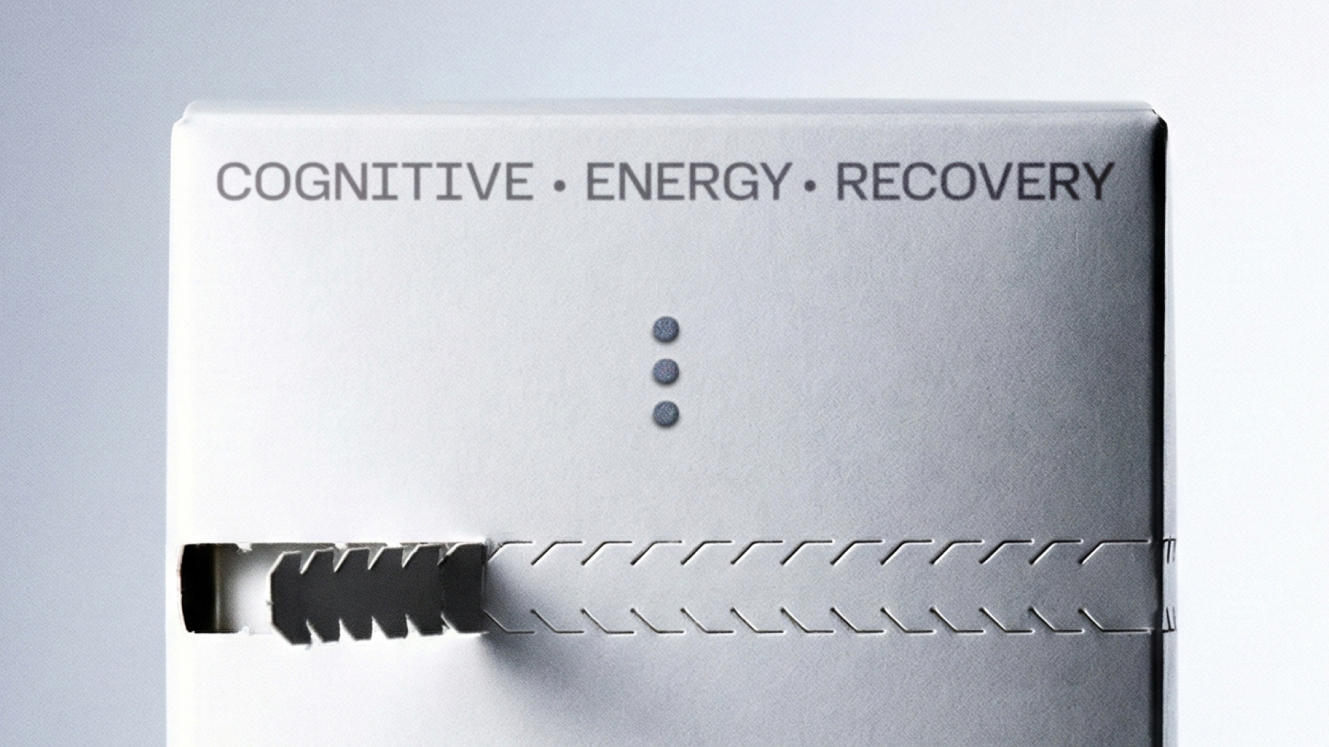
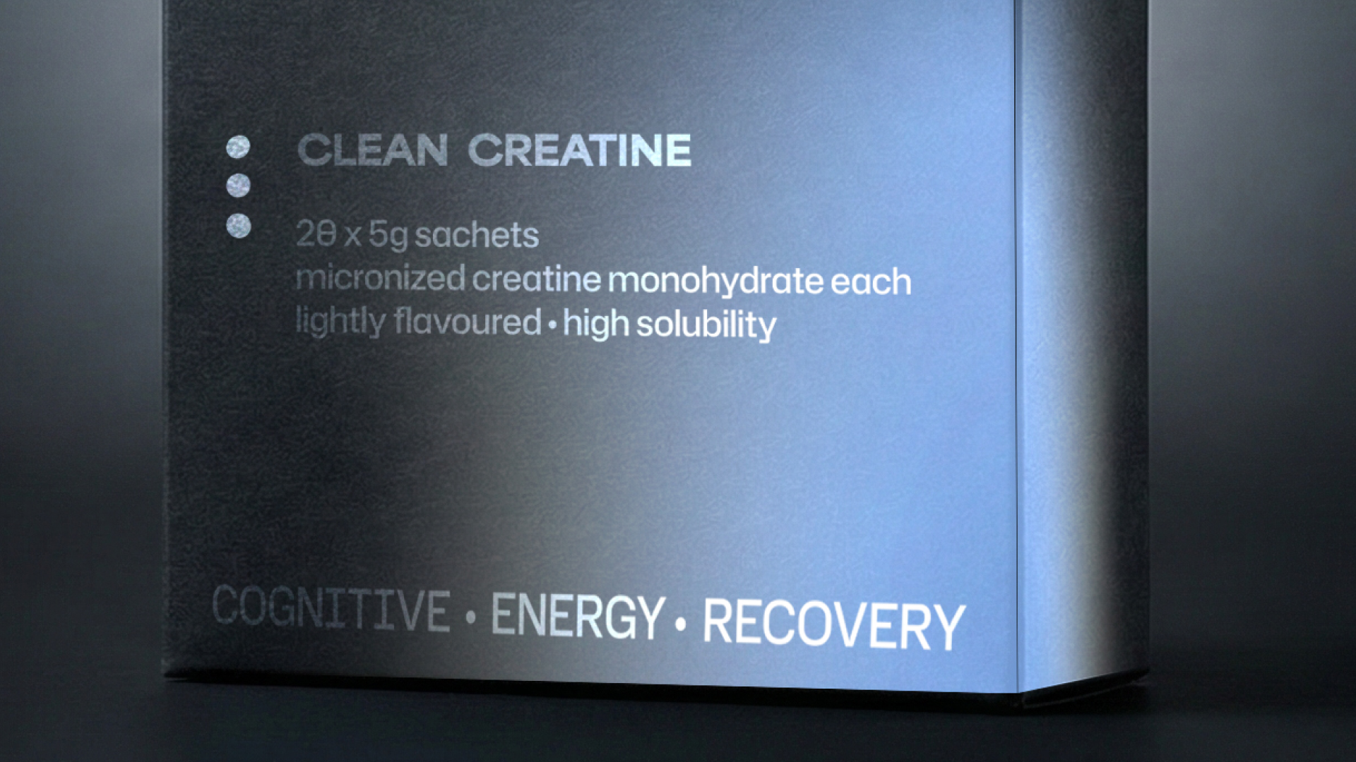
The three horizontal dots are not merely decorative; they serve as a visual code for CREIA's core value proposition. Each dot represents one of our three foundational pillars: Cognitive, Energy, and Recovery. This element acts as a minimalist shorthand for their formula, reinforcing the brand's triple-action benefit even when the full text is not present.