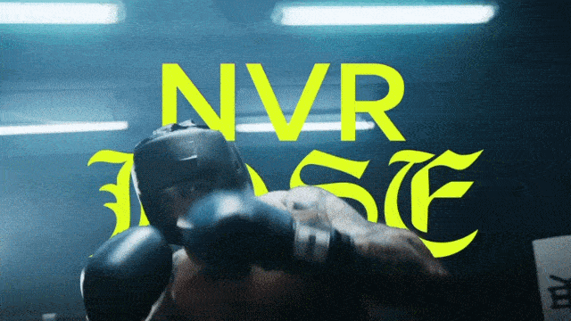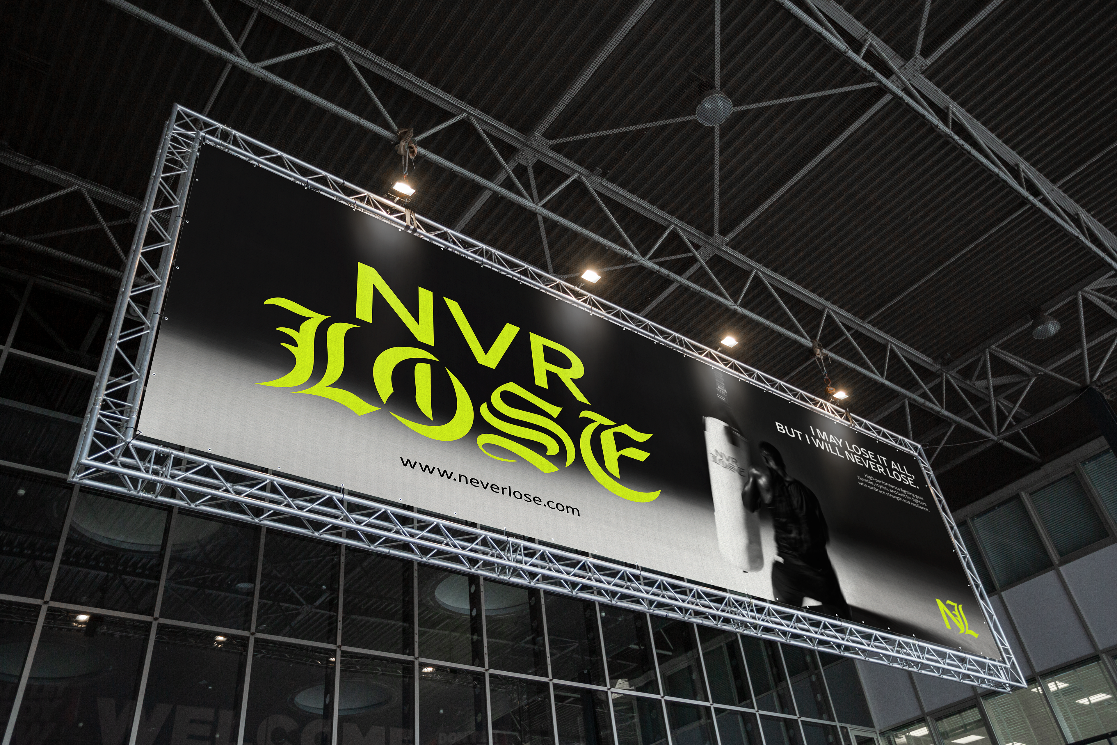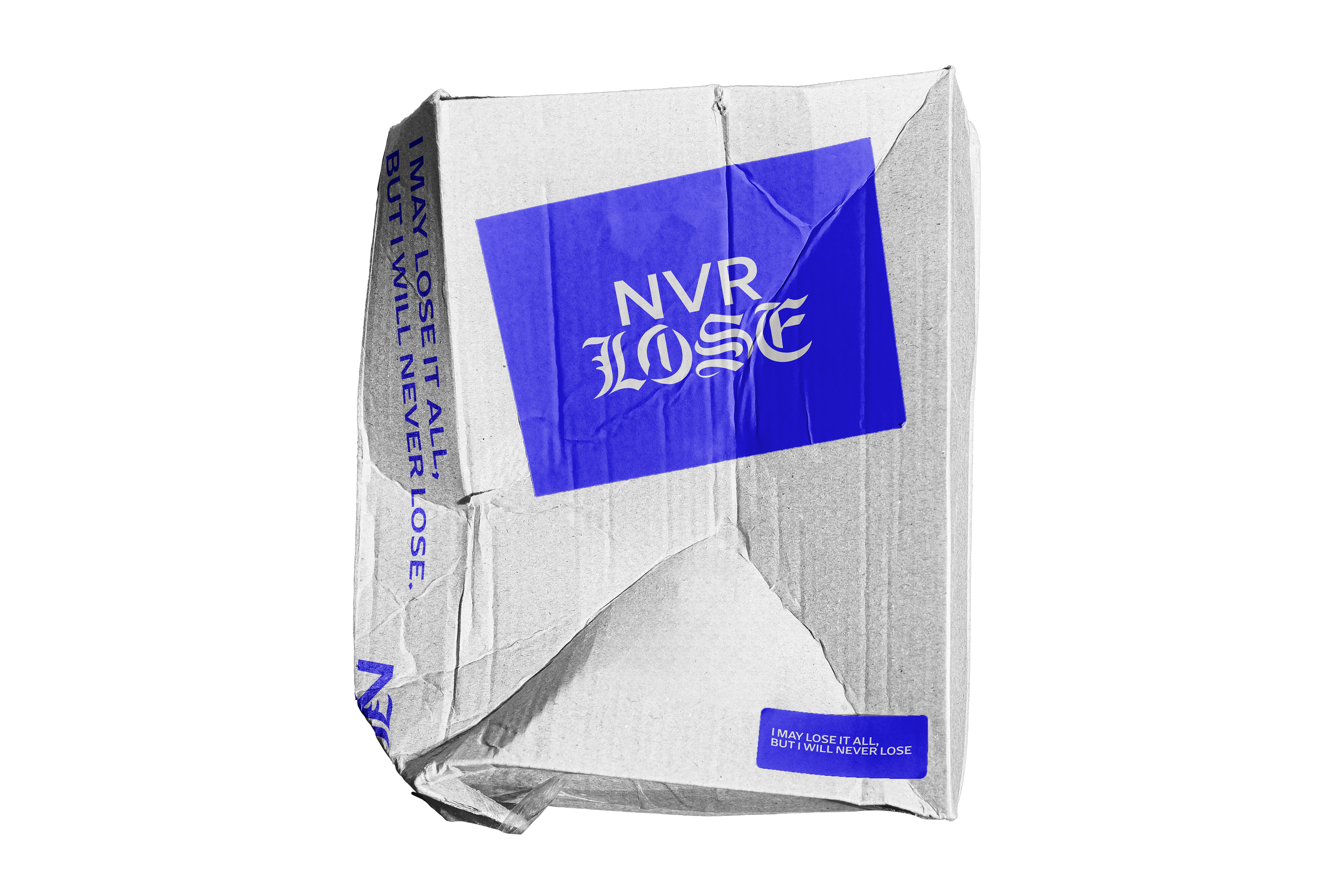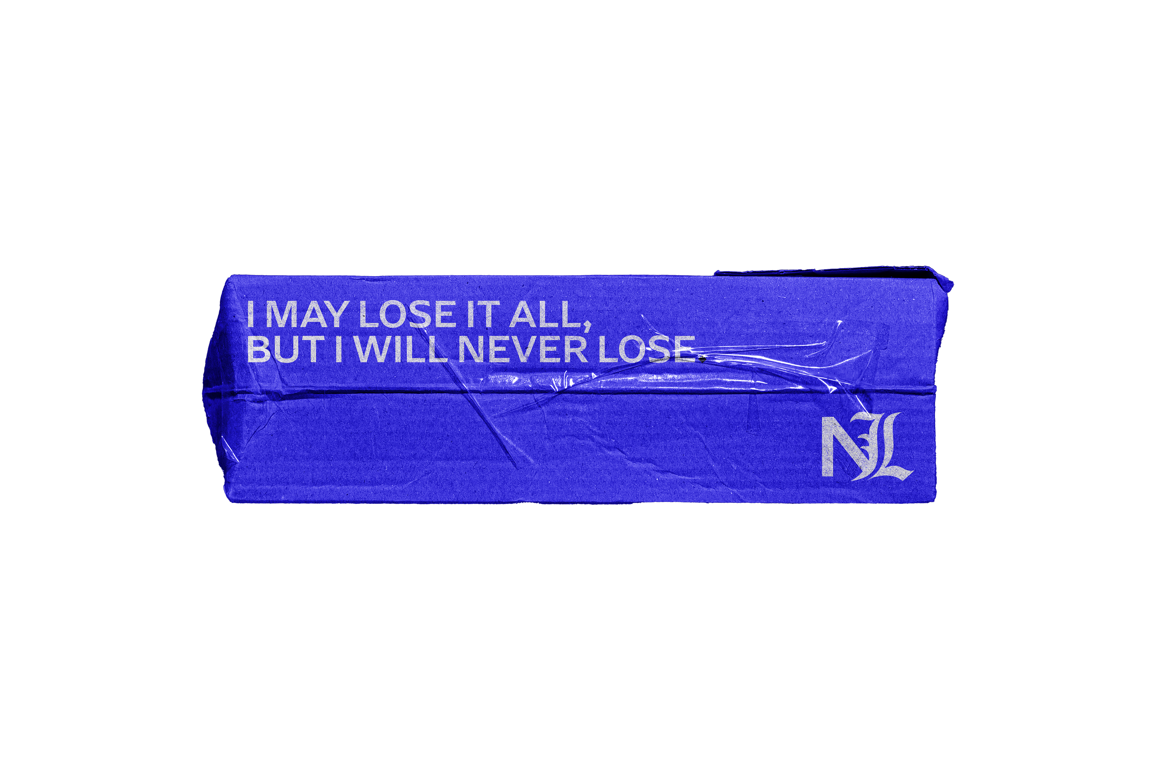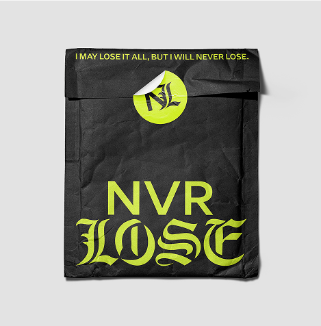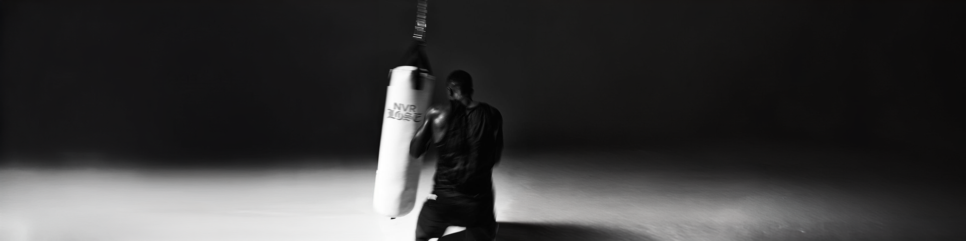
“I MAY LOSE IT ALL, BUT I WILL NEVER LOSE.”
We started this project with a deep dive into the market and quickly saw a gap: much of the branding in the fightwear space felt overly male-focused, both in tone and visual language. We wanted to create something that still felt strong and edgy, but spoke to a broader audience.
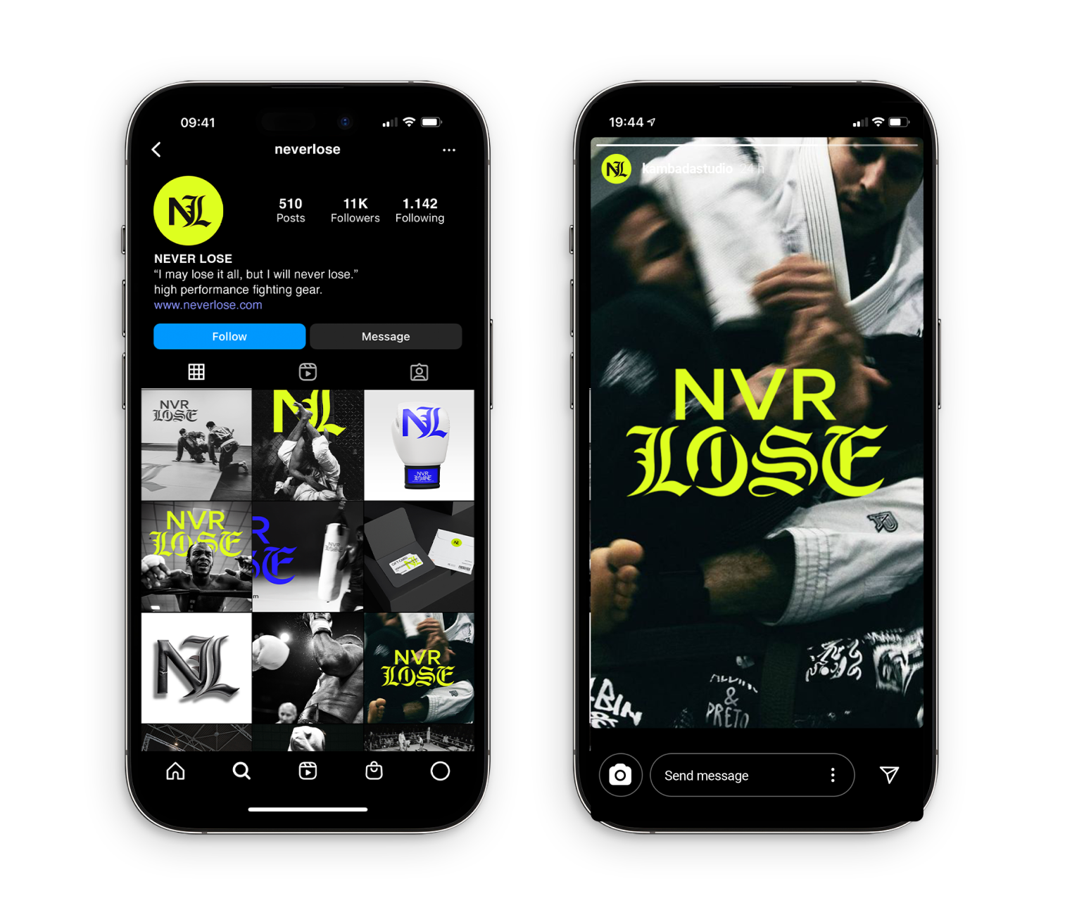
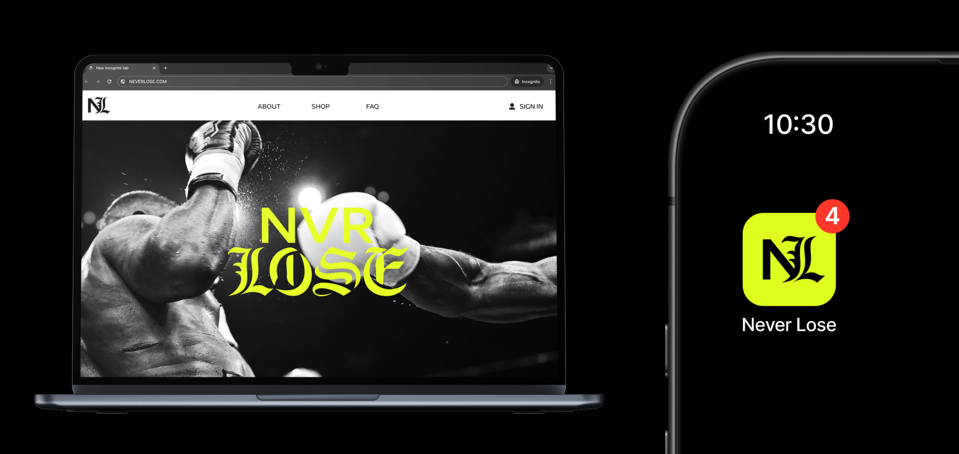
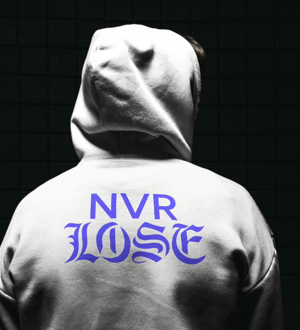
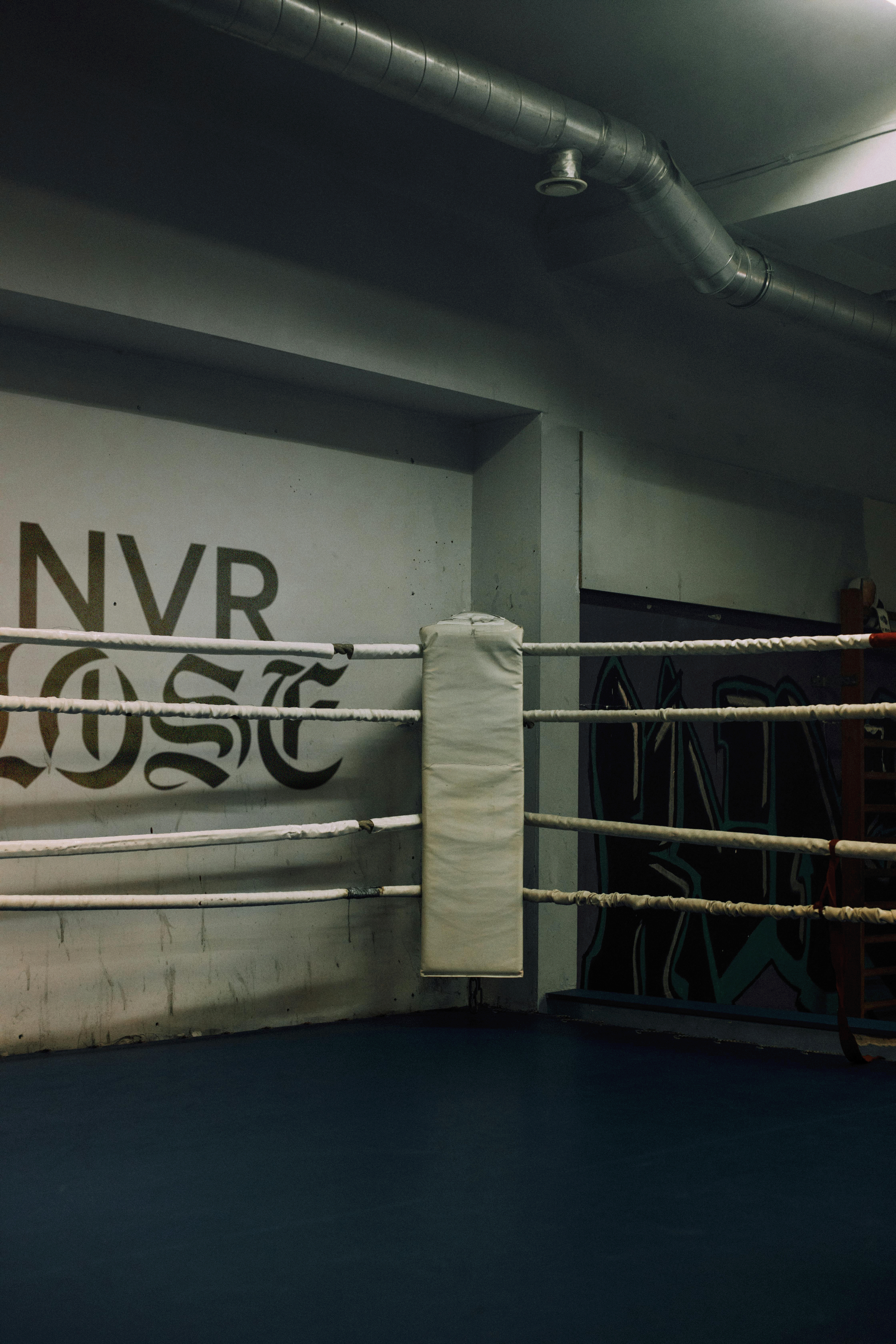
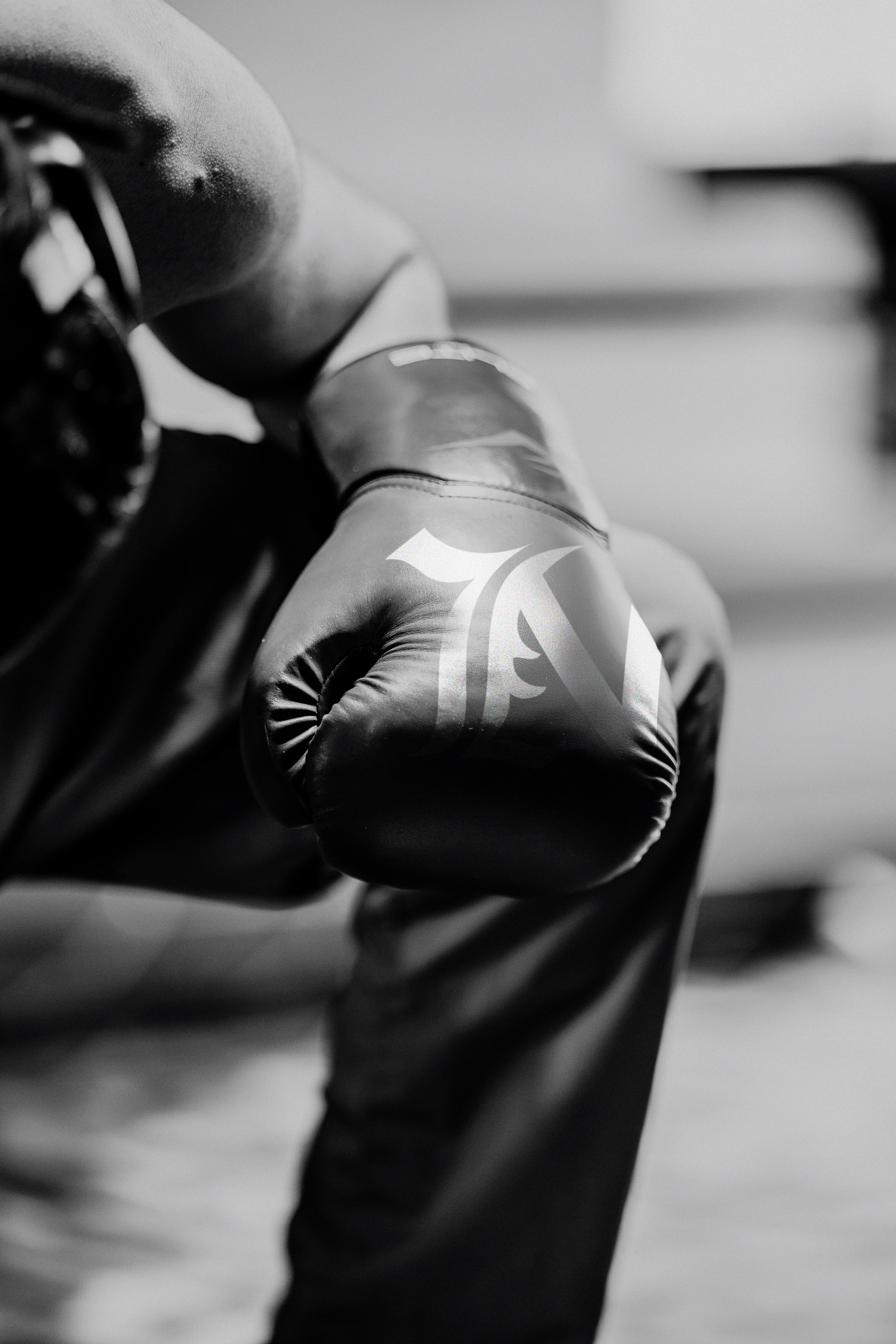
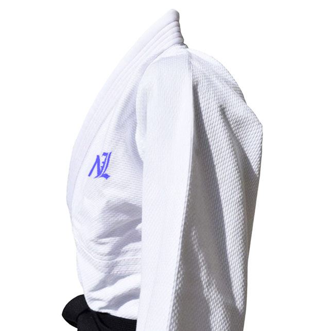
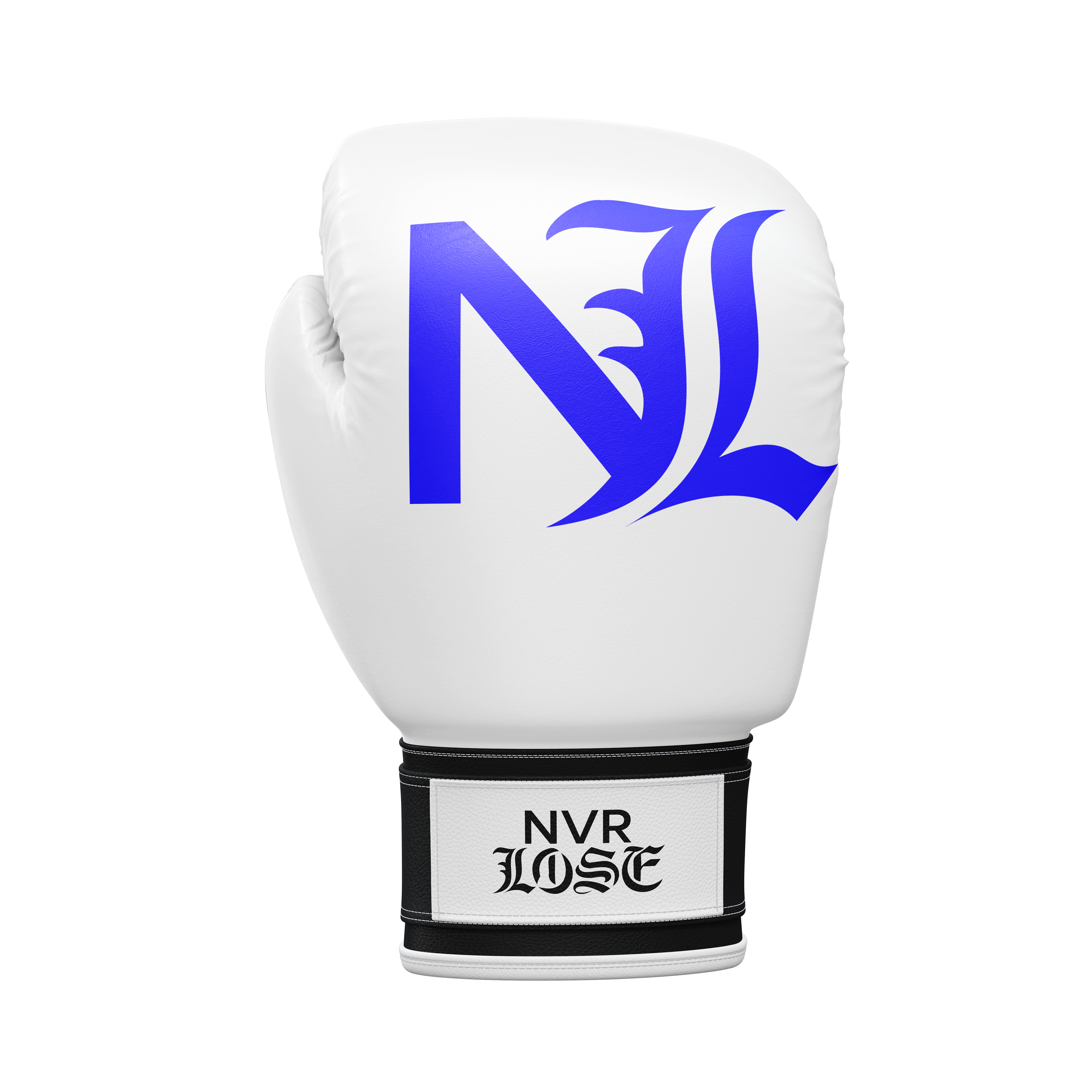
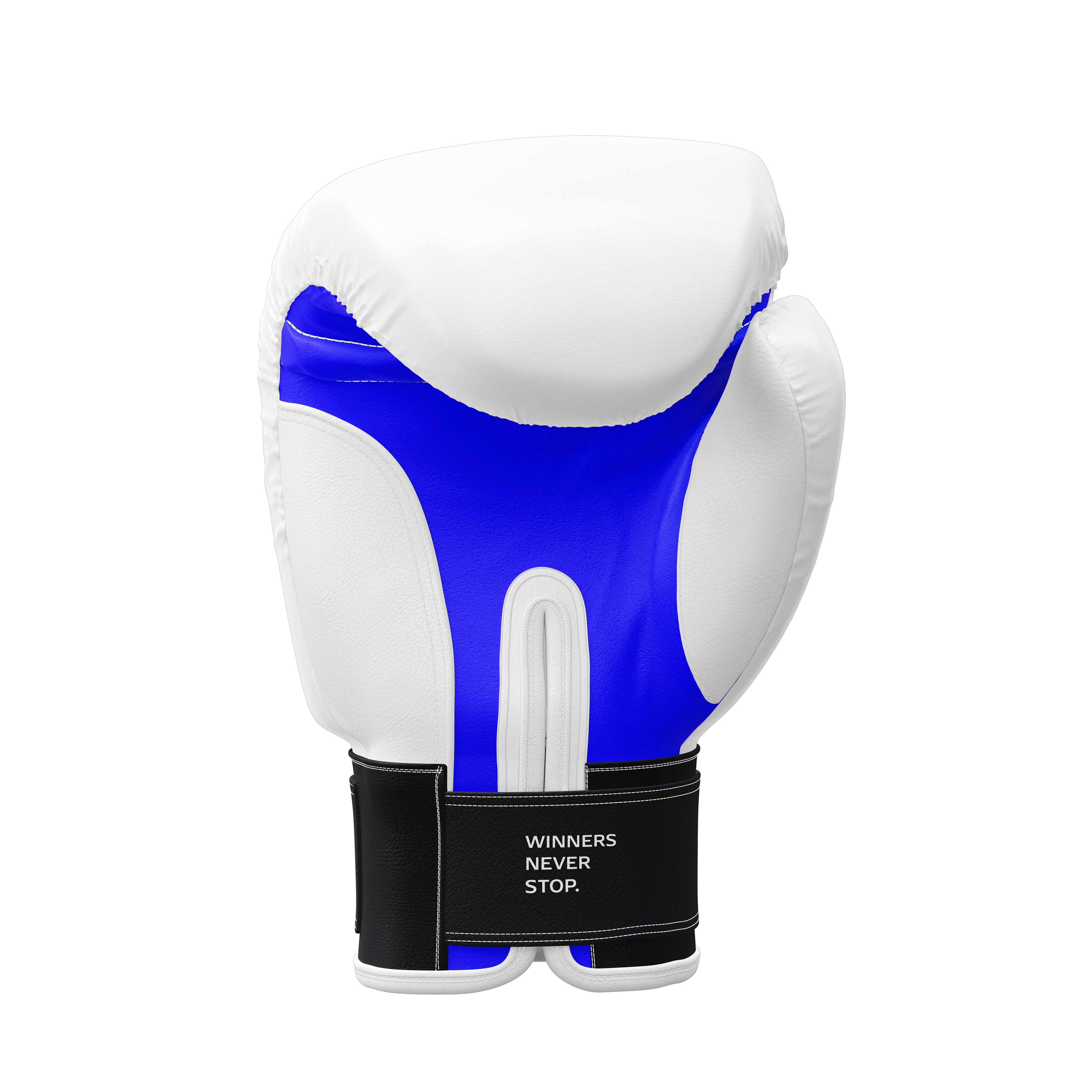
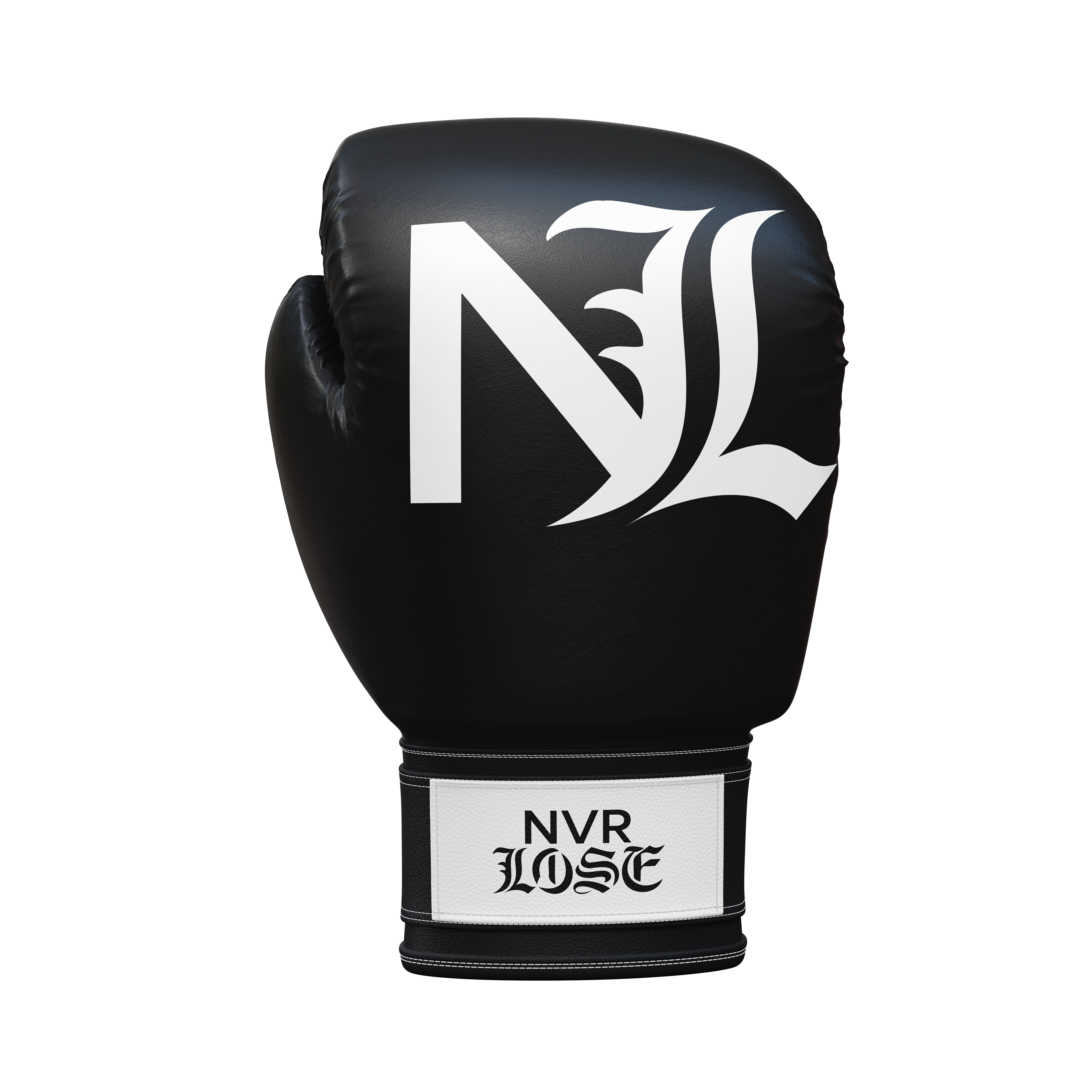
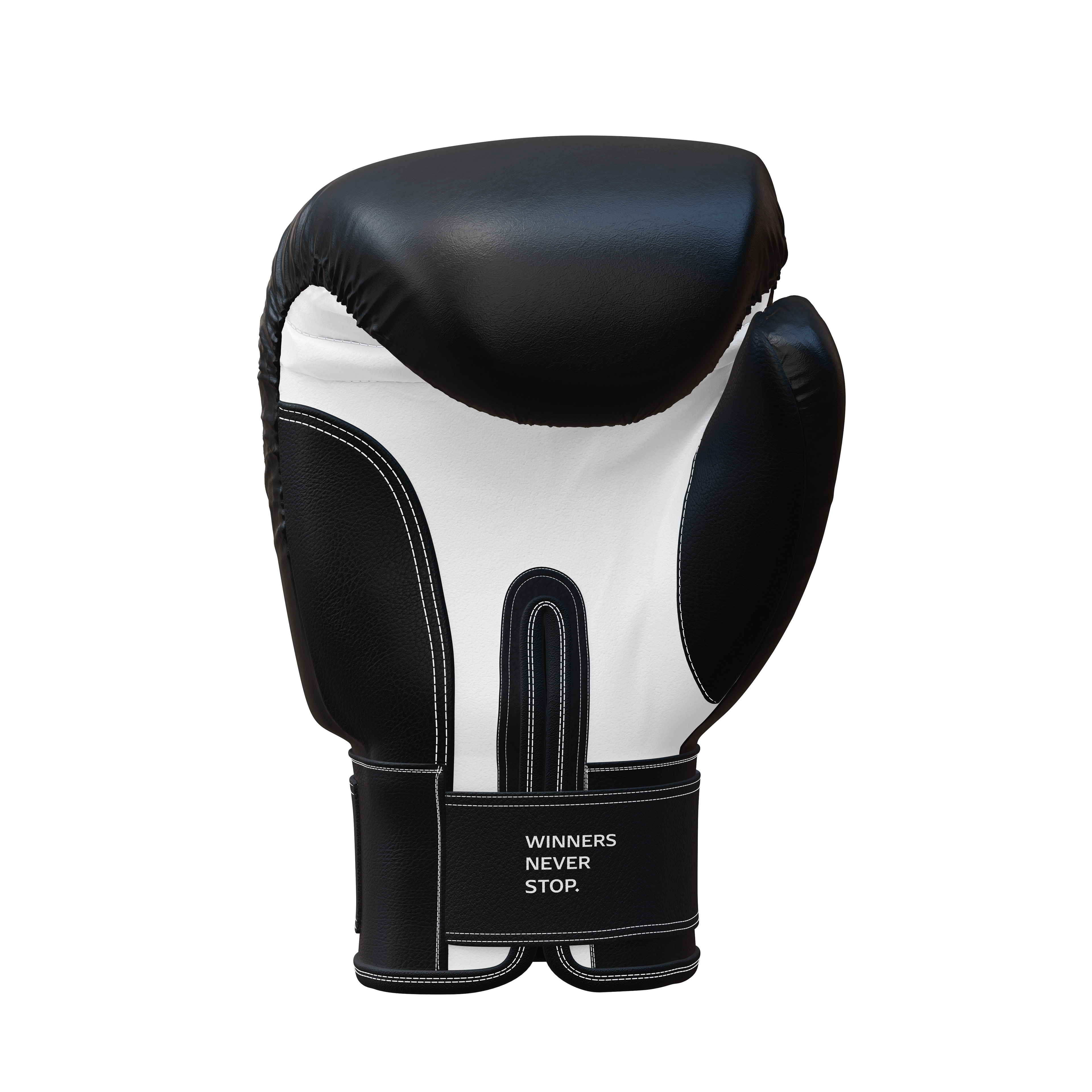
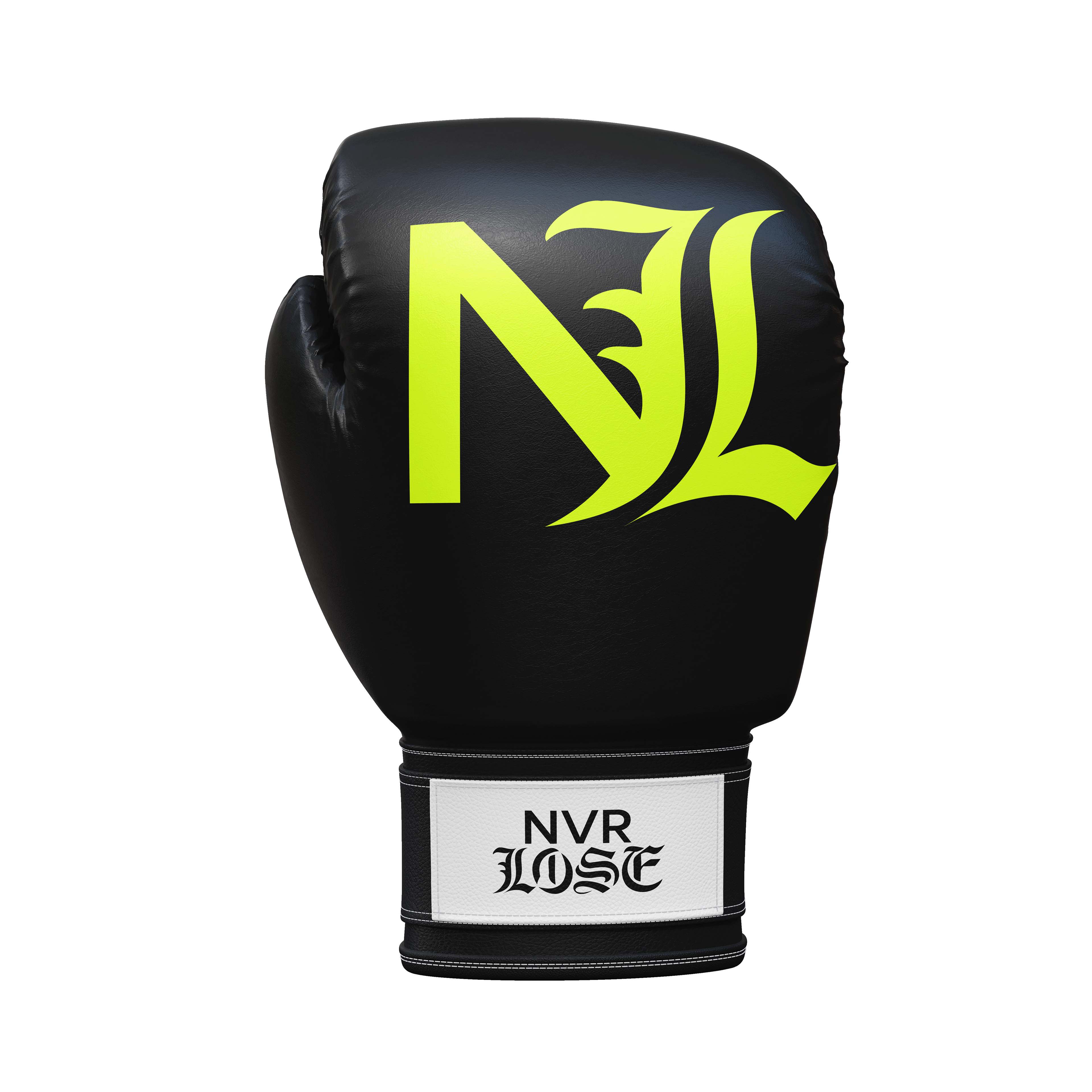
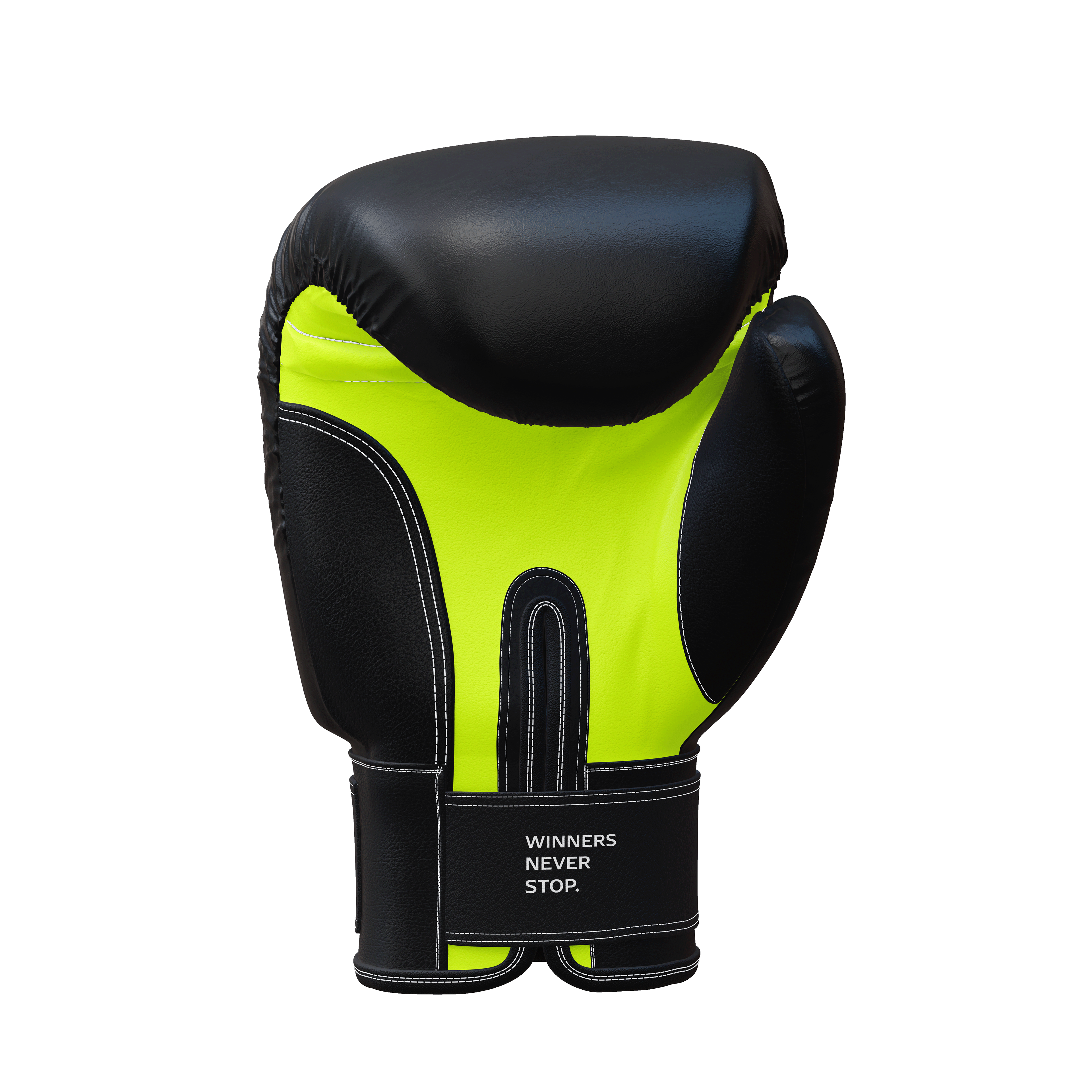
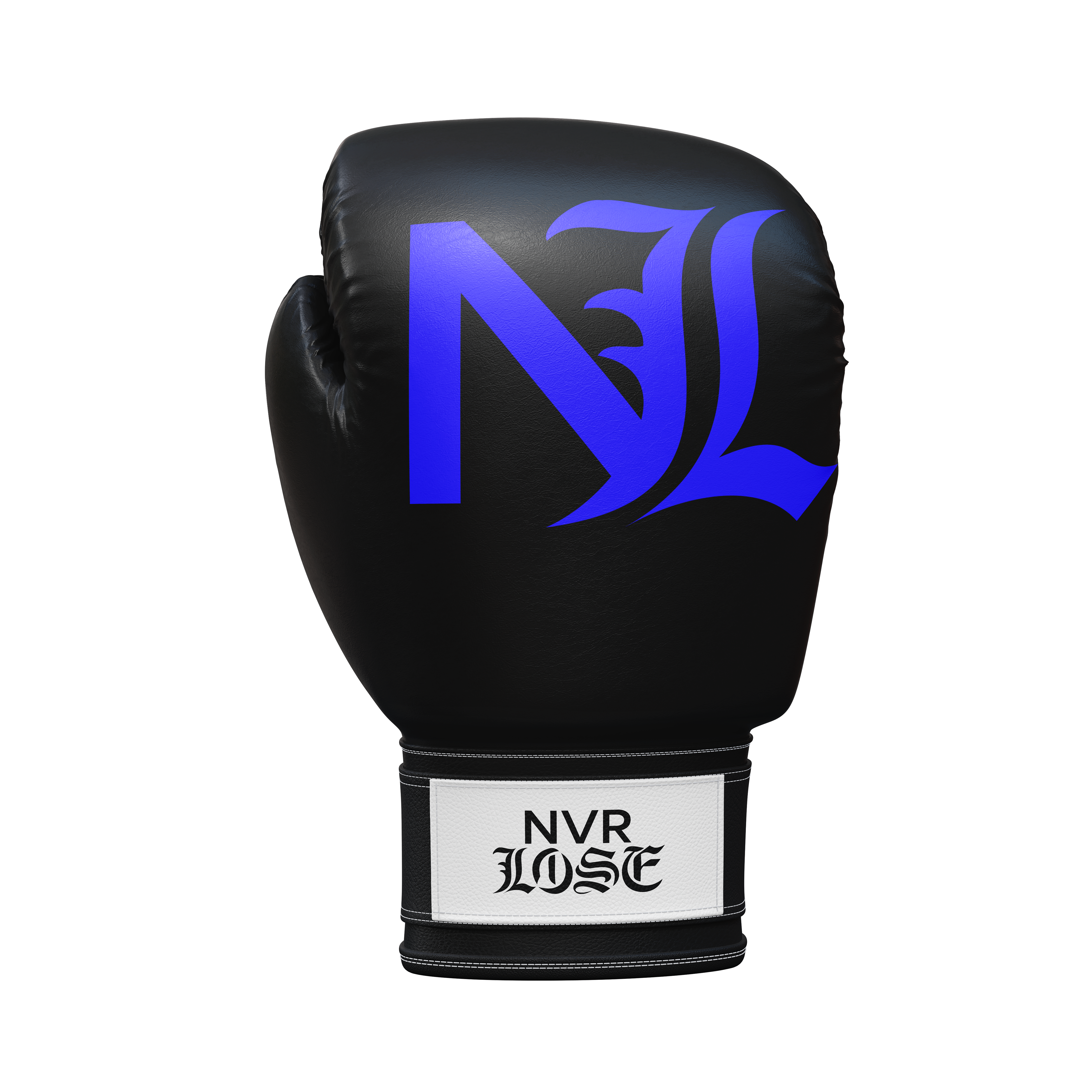
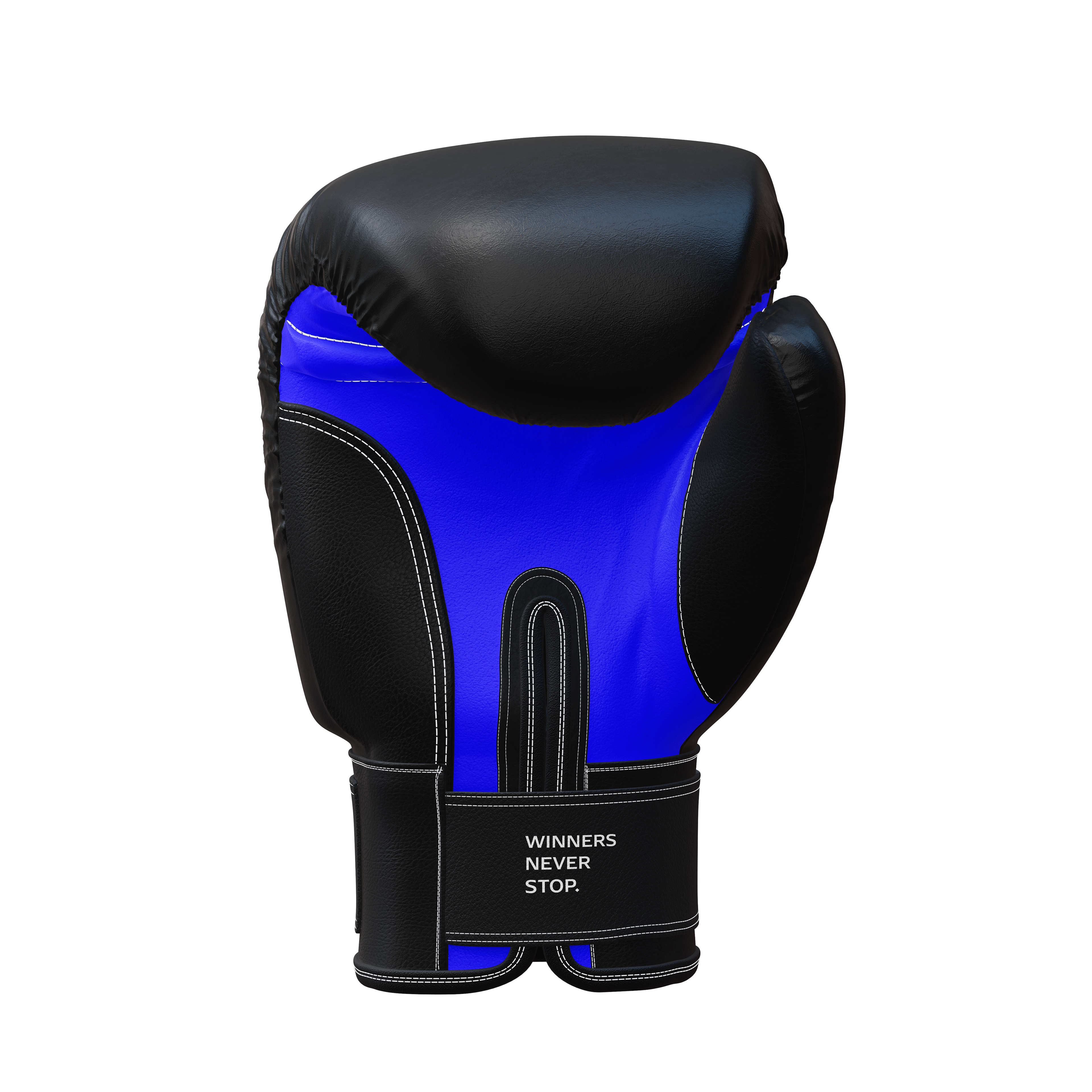
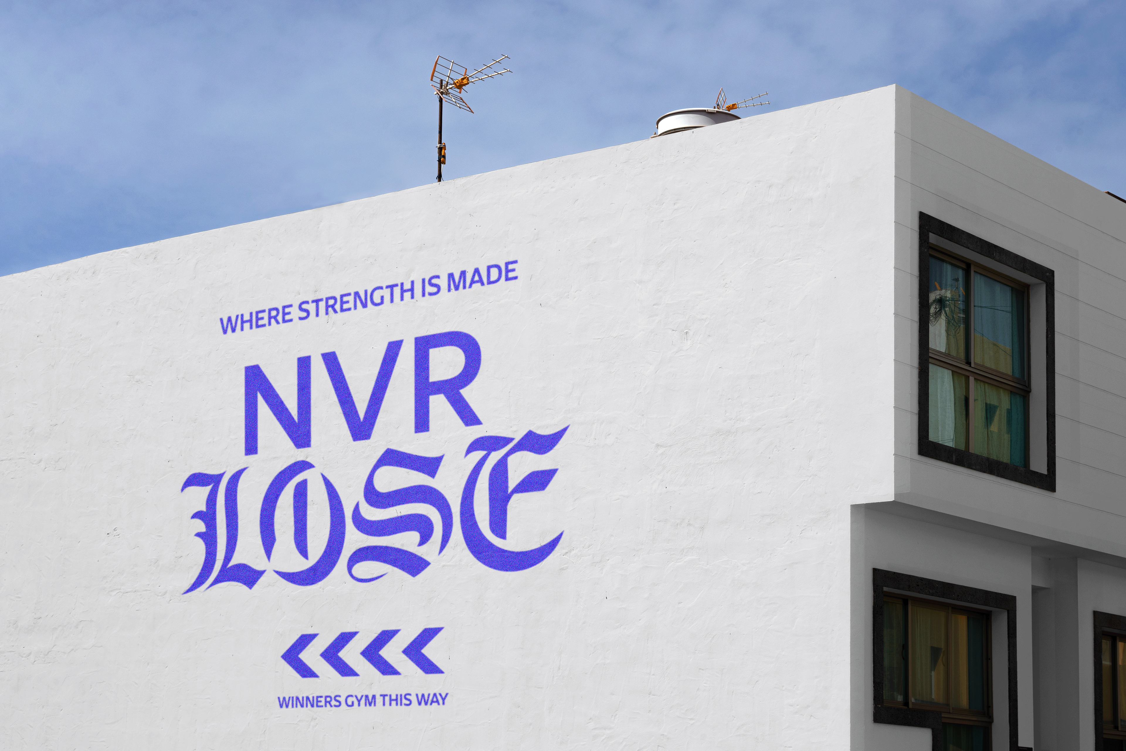
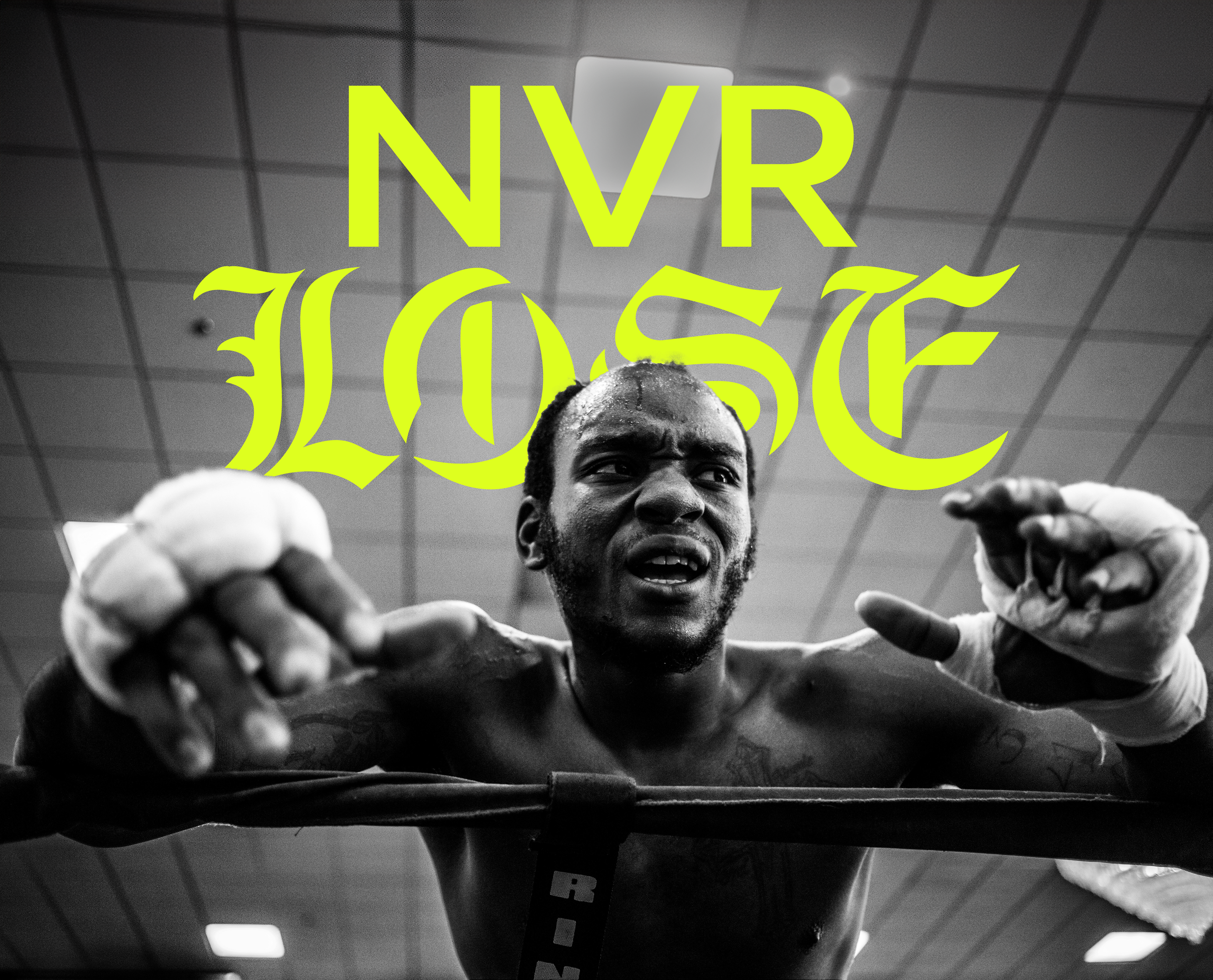
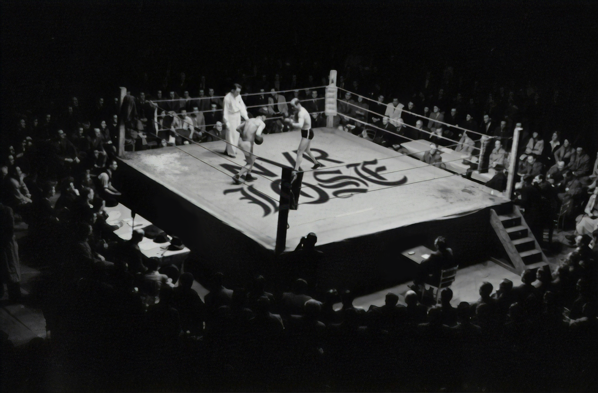
Never Lose is a high-performance fighting gear brand offering rash guards, gloves, wrist wraps, and more. We developed a bold visual identity that channels resilience, intensity, and self-expression, qualities that resonate with the athletes who wear it. Drawing from urban and gothic references, the design combines raw textures with clean lines and striking colour choices like neon yellow and electric blue, giving the brand a distinctive energy.
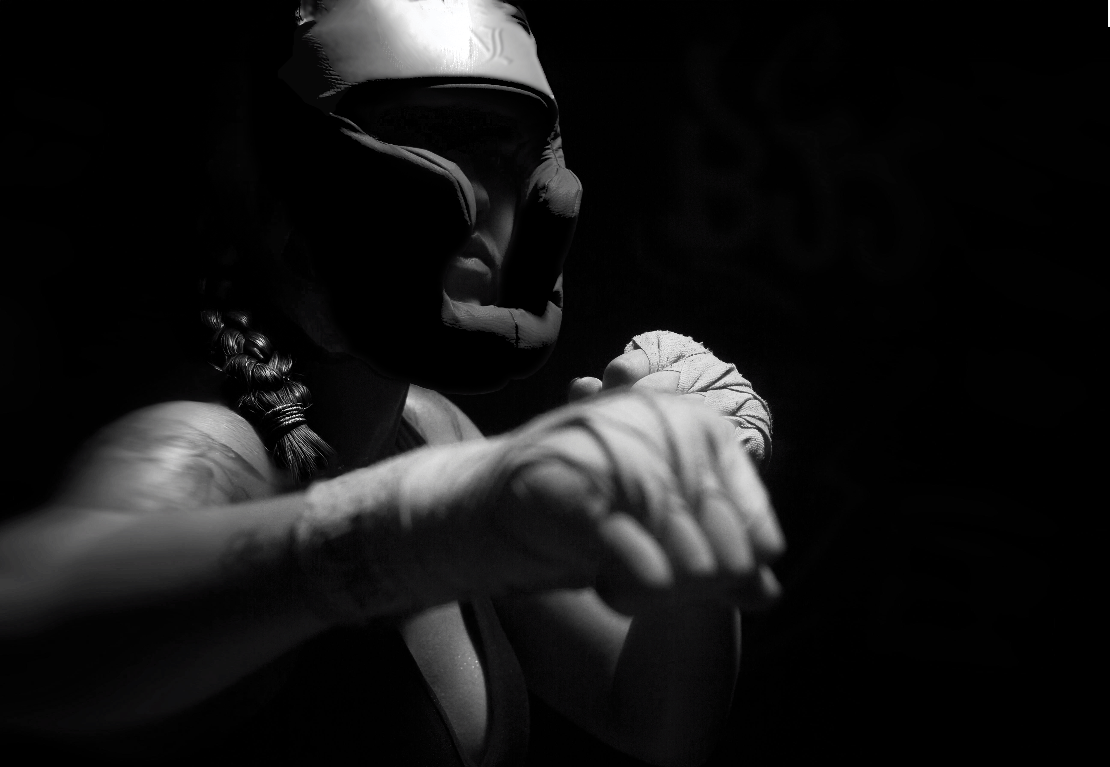
From the beginning, we made sure inclusivity was part of the story. We created visuals that spotlight women and reflect the diversity of the fight community, helping position Never Lose as a brand with strength and attitude that’s not defined by gender.
This isn’t just about gear, it’s about mindset. Never Lose stands for the people who keep showing up, pushing through, and backing each other. We worked closely with the client to make sure every detail reflected that spirit.
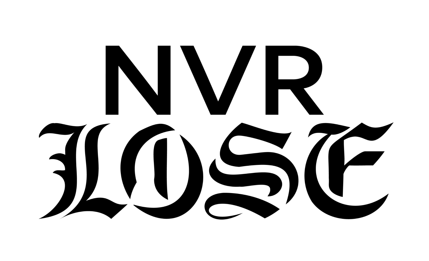
Main Logo

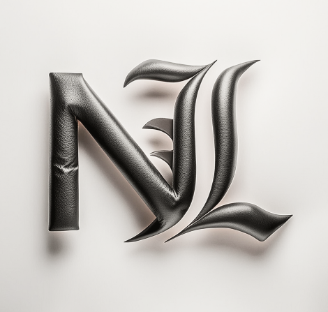
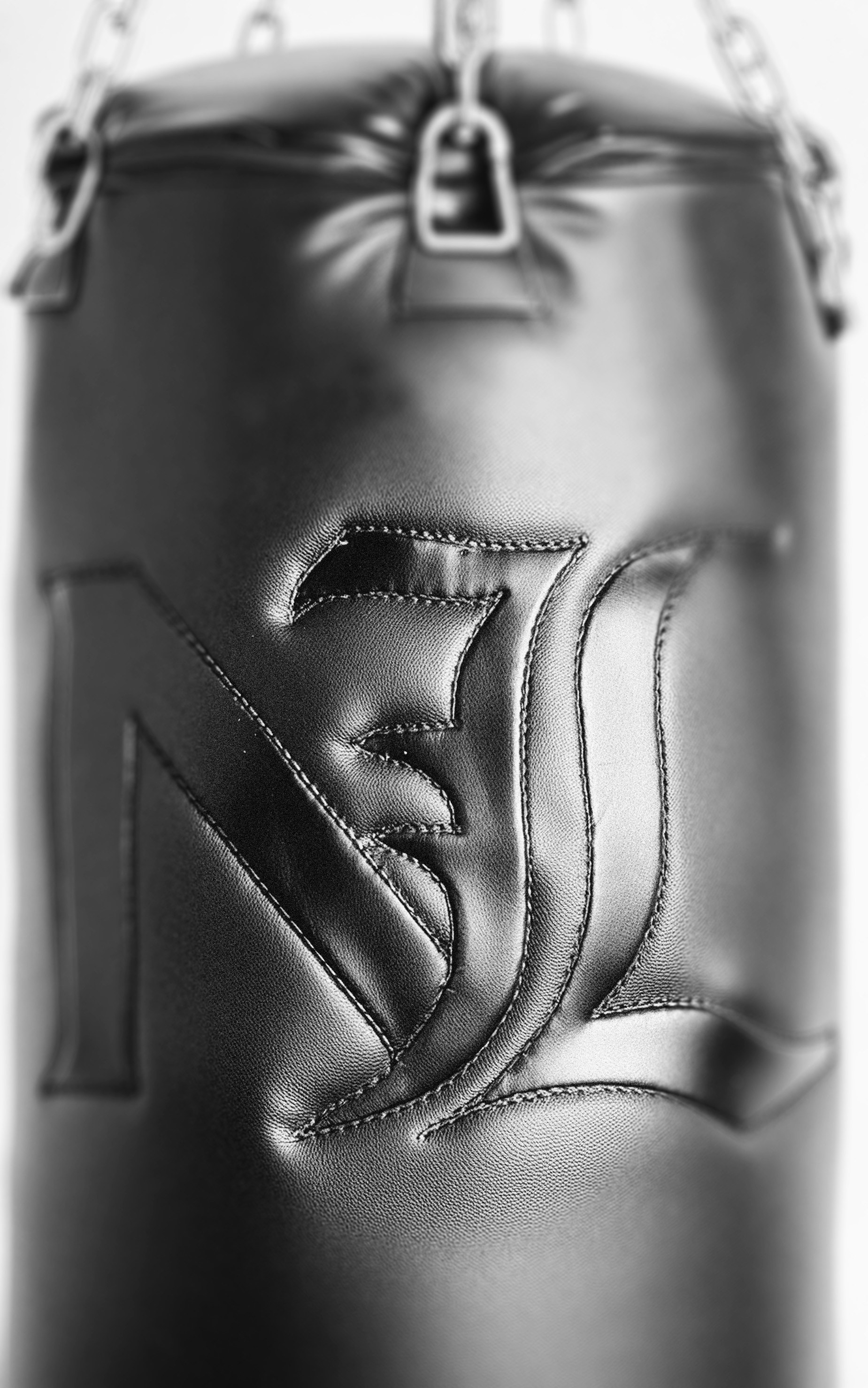
Logo Mark

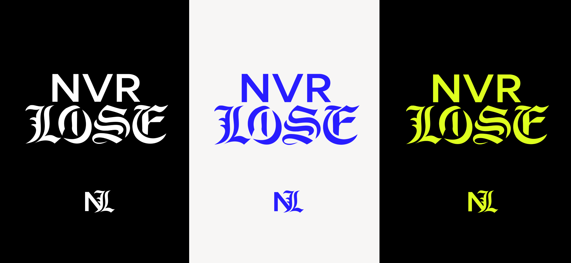
Logo Colour Variation